TECHNICAL TUESDAY // Early Morning Sun

I have been a professional photographer for nearly a decade, and I have photographed a LOT of stuff. Photographing quilts is at the very top of my “very difficult to photograph correctly” list and I haven’t met its match yet. There’s a lot of reasons for this, some obvious, some less so. This is my job - and making every image I create for publication top-notch is something I take very seriously. Let’s just say that I have definitely lost a lot of sleep over the technical aspects of quilt/fabric photography.

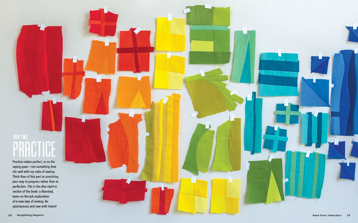
A follower of ours on Instagram asked for some technical information about the photograph shown below, which is found in Nicholas Ball’s new book INSPIRING IMPROV. I thought it was a good opportunity to make a quick blog post answering the question about this gorgeous ambient image we shot on location with Lucky Spool.

NNB_0266.jpg

While we had a few locations for this book, most shooting was done at a cabin along the Northern California coast in a place called Sea Ranch. We spent two days there, and the joy of that meant I could be at the location and shooting right after coffee in the best light of the day - the Golden Morning Hour (the time about an hour -2 hours after the sun comes up.) Golden hour at either end of the day allows for that big, amazing light source in the sky (the sun) to be positioned exactly as we want it for most photography - at a great 45 degree angle. For quilts, it’s even more important - because in order to nicely show quilting we want to skim light over the quilt from the side angle.

The other nice thing about Golden Hour is that the position of the light and its diffusion in the atmosphere creates fabulous soft ambient light. It’s much easier to shoot because nothing is causing harsh shadows or hot highlights.

Remember, though golden hour makes things a lot easier it’s important to note that the sun is always a constant light source. You still need to think of it that way. You still need to position your subject appropriately. My favorite thing to do in morning light is to use the sun as a backlight/rimlight slightly turned in, so that it skims the quilt, throwing a soft, delicate shadow of the quilting. Here’s a terribly, fast drawn diagram:

quilt_light.jpg

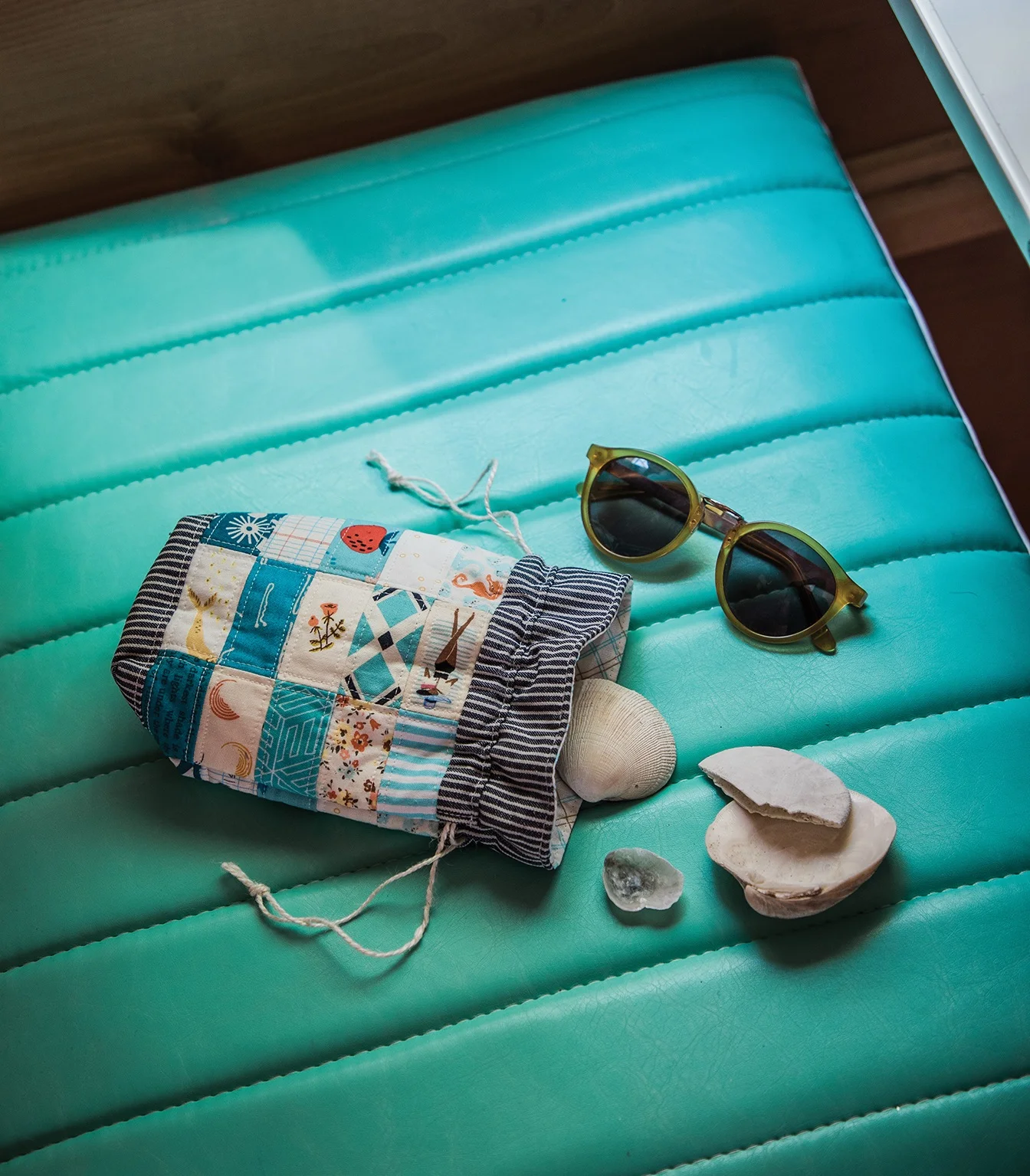
It’s really hard to say this based on the really pretty location we were in for this particular shoot, but it’s a good time to tell you again: your photo is made by the light, not the location. When you’re outside, using the sun, remember that you are shooting with a light source that cannot be moved. That means you have to move around it. Do not focus on backdrops or locations. Focus on light. The final technical note on this photo is that this bench was under a different tree in the backyard that Kristy scouted as a beautiful backdrop for this and other photos for the book. It totally was beautiful, but it was at a position where there would never be good 45 degree angle sunlight and since we were sitting on a yard with tons of other plants and trees there was no reason to stay at that spot. Sometimes, we don’t know what is really going on at a location until we get there. So we picked this bench up and put it here, in the good light. ALWAYS FOLLOW THE LIGHT. See it, work with it, be rewarded. :)

FREE DOWNLOAD // Design Your Summer

TenWeeks.jpg

Back by popular demand—or let’s face it, because I demanded it—it’s the 10 Weeks of Summer template.

Working families everywhere love to dread summer and it’s infamous 10 Weeks of unscheduled childcare. When I worked full-time at a publishing house, it was so difficult to fill up the 10 weeks in a cost-effective way without burning out my kids and going broke. Now that I’m on my own, it’s tempting to just say that my girls will be able to entertain themselves while I get work done in the middle of the day so we can save some $ and not over-schedule them….HA!!! I’ve been fooled before, it doesn’t work that way. I NEED TO GET MY KIDS OUT OF THE HOUSE for their sanity and mine. But I can’t just sign them up for camps every week, I can’t afford it.

Enter: my trusty template.

10Week_2019_template.jpg

Mapping out the weeks lets me visualize where the girls will be and helps me spread out the cost over the course of the summer. Let’s say I have Grandma come for Week 2, then I’ll sign them up for that cool camp (read: $$) for Week 3, followed by the super-affordable Girl Scout camp for Week 4. Maybe I do a kid-share for Week 5 & 6 with neighbors and then we go to WI for Week 7…you get the idea, right?

If you’ve got 1 or 2 kids, just print this bad boy out and start penciling in your plans (print a few out for 3 or more kids). It’s simple but really helps me get going on the planning and keeping on track.

So mash up some guac, crack open a Lacroix and get planning your 2019 summer!

+
Kristy


DESIGN ARCHIVES // Brave New Quilts

I’ve been fortunate to be designing books for the craft publishing industry since about 2004. And for 3 years before that, I was a Production Assistant getting the books ready for print. Needless to say, I’ve worked on a lot…A LOT…of quiltmaking books. And while I find myself extremely lucky to have worked on each and every one of them—even the tough ones!—I do have my favorites. Books become my favorites for a whole host of reasons: a connection with the author, the quilts really inspired me, the book design was a fun challenge, the photoshoot was a blast.

And sometimes, it’s just all of it: the content, the author, the book team, the design, the quilts. Brave New Quilts by the late Kathreen Ricketson is one of those books.

10935D.jpg

I remember sitting in the focus meeting for this book before it had a title and I was so very excited throughout the entire 90 minutes. I couldn’t get over how wonderful the concept was for this book: quilt projects inspired by 20th century art! From the minute the editorial and marketing team concepted the title, I was in love.

Ricketson_spread2.jpg

Working with Kathreen was a pleasure. She and her family were busy on an epic year-long road trip during the book design and production phase and she was very generous with me as a young designer—open to my unconventional layouts and layering of images. Her one comment about the cover design was, “That’s some big type.” I couldn’t disagree.

10935_07_BrightFuture_ArtDeco 2.jpg

The project was very personal to Kathreen. She and her husband shot the photos in their home, with their children in some of the images and her drawings, sketches and notes are sprinkled throughout the layout. This book has a heart and soul and I felt it as I was laying out each page.

10935_05_ClearCut_Bauhaus 1.jpg

Back in 2013, when I was in the middle of finalizing the book to send to the printer, I received an email saying that Kathreen and her husband had died in a tragic accident while on their trip. This incredibly heartbreaking news still stirs me up a bit as I think of it today. Just as flipping through her book still inspires me to play and think outside of the norm when I work.

I am grateful for Kathreen’s influence on me as a designer and her book will always be one of my favorites. Together we pushed what a typical quilt book cover looked like and gave readers something new to consider as they read and flipped through the pages. Her ability to let go and trust another creative with her work has stayed with me and I try to practice that with others that I work with. Thank you, Kathreen. You truly are missed.

Who has inspired you in your work? Who has made a lasting impression?

+ Kristy

Brave New Quilts
Book Design: Kristy Zacharias (pre-P+P)
Publisher: Stash Books
Author: Kathreen Ricketson

Nice Kern-Job

The thing about design is that it’s not always noticeable. We designers are in the background agonizing over things like a fonts point-size so that books are readable; left, center or right-aligned text; 95% black or 100% for the running font; making sure the footer text isn’t too close to the trim or too close to the text. But really, what sucks up most of our time is kerning.

Ahhhh! Kerning: the space in between the letters. The spaces that nobody notices, until they do.

I like to think that one of the most important parts of a designer’s job is to keep people focused on the task at hand by cleaning up, removing or adding, and making an experience feel beautiful and seamless. If a book or a space or a product gives you an easy, calm feeling, it is because of design (and there is probably some decent kerning going on).

Here’s a quick example of how I spent a good 20 minutes of my time as I was laying out the pages for Inspiring Improv by Nicholas Ball for Lucky Spool.

LS0046_Improv_Design_pg30a.jpg

This is a looooovely image, isn’t it? Nick had the brilliant idea of taping all of his improv blocks up on the wall in color order. So pretty. I just want to keep my eyes moving amongst all of those inspiring blocks, but my eye gets pulled down to the bottom left of the page, right to that ragged line of text. What a bummer! Maybe it’s just me? But I couldn’t leave the page that way, so I justified the text, giving it a nice clean edge.

LS0046_Improv_Design_pg30b.jpg

Ok, that’s a little better, at least I’m not attracted to the last line of the paragraph jutting out anymore! But now I’m distracted by how the text has a bunch of space between the words and letters in the first few sentences and then gets really bunched towards the end of the paragraph. AND I don’t like how close the last line is to the page number. Jeez Louise, I drive myself nuts!

LS0046_Improv_Design_pg30.jpg

There we go. So after spending a little time adjusting space between the words (tracking) and the individual letters (kerning), I’ve got the text to a nice, tidy block of unassuming text.

But I’ll be honest: now that I’ve spent some time writing up this post, I have grown fond of the ragged edge from the first image. The ragged edge does make sense with this particular image in that it feels organic and fluid, much like the improvisational blocks. That brings us to a different conundrum that book designers face: consistency. This is just one opener from the book, there are a few. As the designer, I was tasked with selecting the best design solution for the book as a whole, not for one spread at a time. In the end, the author and I decided that the justified text for the openers was the most successful choice for the overall design.

Welcome to the inside of my brain which is a constant back and forth of what-if’s and yeah-but’s!

What sorts of nitty-gritty does your job get you into?

+
Kristy

Inspiring Piecing
Book Design + Style Photography: Page + Pixel
Publisher: Lucky Spool Media
Author: Nicholas Ball

FBF // Serendipitous Natural Light

One of the first projects Nissa and I worked on together as Page + Pixel was shooting the style photography for Amy Gibson’s Quilt Block Cookbook for Lucky Spool. It was a big project with loads of bird’s eye/layflat shots and Nissa and I wanted to add some variety to the images somehow. Susanne—publisher and editor for Lucky Spool—had a vision of a person holding up the quilt blocks so we went ahead with that cute concept.

block_2.JPG
block_4.JPG

It was one of those perfectly-overcast-but-not-too-overcast days and Nissa positioned us perpendicular to the floor-to-ceiling windows. This gave us some warm yet diffused autumn light. We were so excited by the natural shadow and depth that came through! Not only were we able to capture Amy’s impeccable fabric combinations, but the diffused side light allowed her beautiful block construction to be seen through the fabric. Perfect for this book full of block recipes!

Can’t go wrong when skill and serendipity are in sync.

block_5_opt.JPG
block_8.JPG

What are some of your favorite serendipitous photography moments?

+
Kristy

Quilt Block Cookbook
Style Photography: Page + Pixel
Publisher: Lucky Spool Media
Author: Amy Gibson


Photo Styling // The Surface Matters

Bird’s eye, layflats, still life….whatever you call them, these are photos that require a surface to be shot on. With the camera positioned just above the subject, the styling will rely on a more graphic look due to the lack of dimension that will come from the angle of the camera. As simple as these types of photos appear, they do require a fair amount of propping and styling. It can be quite fun to create interesting lines and juxtapositions within the photo composition, but when you are short on time or on a tight budget, giving some extra thought to the surface that you’re shooting on can elevate your photos without a ton of effort.

The following images were taken for Heidi Staples’ new book, Patchwork USA (Lucky Spool Media). We played with a lot of surfaces in the styling for this book in order to achieve a warm, nostalgic aesthetic. By swapping out the different surfaces, we were able to keep the styling minimal so that the projects took center stage.

Color Book // Shot on the reverse side of a quilt in order to give a warm, sweet feeling to the image.

Color Book // Shot on the reverse side of a quilt in order to give a warm, sweet feeling to the image.

The window light was perfect in one of the bedrooms of the home we were shooting in. In order for the shot to make sense near that gorgeous light, we laid down a quilt with the back side up so that the top design didn’t distract from the Color Book project. The result was a textured and colorful backdrop for the cloth books. The color and the pattern immediately indicate that this is a project for children.

Scout’s Honor Pencil Case // Shot on top of a vintage map.

Scout’s Honor Pencil Case // Shot on top of a vintage map.

A strong theme that runs throughout Patchwork USA is that of road trips. Heidi sent us tons of vintage maps and postcards to use in the photography and one of my favorite ways to use the maps was as a background surface. Laying out the map adds a wonderful graphic quality to the image and it helps carry the road trip theme. Best of all, it was so easy!

Curio Pocket // Shot on top of a vintage steamer trunk.

Curio Pocket // Shot on top of a vintage steamer trunk.

Nissa and I have a favorite piece of perfectly weathered wood. It has the best tone and texture and it is very tempting to use it in every photo…everything looks beautiful on it! But we want to keep our images feeling new and one-of-a-kind, so we decided to play around with shooting on this vintage steamer trunk that belonged to my Grandpa. We love it!! So much life and texture is added to the photo from simply placing the projects on the edge of this trunk and by utilizing the brass details. Simple and effective!

Beachcomber Drawstring Bag // Shot on a vinyl seat.

Beachcomber Drawstring Bag // Shot on a vinyl seat.

Serving multiple purposes, this vinyl seat was the perfect place to shoot this drawstring pouch. Indicating “road trip” as it is the bench seat inside a Shasta, adding an easy pop of color to the image, and creating some visual texture with the stitching on the seat, we loved using this surface as an easy way to tell a story.

While all of these projects would have looked great on our favorite weathered wood, the varied surfaces do more to tell the author’s story and really bring each of the projects to life.

What are some of your favorite surfaces to shoot on?

+
Kristy

Patchwork USA
Book Design + Photography: Page + Pixel
Publisher: Lucky Spool Media
Author: Heidi Staples