style photography

FBF // Work it, Wendy!

MINIS-22_WEB.jpg

It’s not everyday that we source a shoot location that comes equipped with the perfect puppy-model. And believe me when I say that when we do, we get a model release form signed and we put that puppy in a book!

MINIS-24_WEB.jpg

Wendy was the sweetest and added the perfect touch of hominess to Alyce Blyth’s beginner sampler book, Mini Masterpieces, for Lucky Spool.

+
Kristy

OTP // Mini Masterpieces

A few weeks ago, Mini Masterpieces by Alyce Blythe for Lucky Spool was sent off-to-print. What a fun book to work on! The quilts on this book cover are not photoshopped together, they are the actual quilts hung on a wall. Aren’t they great? They really are minis.

LSID0048_Mini_frontcover.jpg

Designing and photographing a cover this way appears like it should be pretty quick and simple (Spoiler: the more simple the layout, the more challenging it was to put together). There were endless configurations that we could place these quilts in, it seriously began feeling like a giant game of tetris! Playing with the shapes and balancing the color, considering where the title would be placed and which quilts worked best together…I’m kicking myself for not recording a time lapse of this set up.

Composing the image while keeping the text in mind is my favorite way to design. I suppose it’s a good thing that I know a great photographer.

+
Kristy

Project: Mini Masterpieces
Author: Alyce Blythe
Publisher: Lucky Spool
Book Design + Photography: Page + Pixel

LOOKING BACK // Pretty Scissors

Sometimes when I’m stuck I find myself scrolling through work that we’ve done in the past. Maybe it’s a way to remind myself of where we’ve been, that work comes and goes and to let myself be okay with taking time to reflect and just enjoy what’s right in front of me.

A few years ago now, I bought this pair of scissors at QuiltCon, they stopped me in my tracks and I had to have them. Confession: I have never actually used them, I just love the way they look.

NNB_6071.jpg

Never one to say ‘no’ to a fun photo opp, Nissa let me stage a shot of the shiny sheers atop a piece of beautiful found wood beneath the most perfect window light. I could look at this image all day…the smooth metal juxtaposed with the rich, textured wood is, to me, perfection.

NNB_6078.jpg

I encourage you to take a minute to notice and get lost in the beauty of something around you. It might even be something you made. We can get so caught up on creating the next best thing, it’s okay to take a minute to love something you’ve already done.

+
Kristy


Photo Styling // The Surface Matters

Bird’s eye, layflats, still life….whatever you call them, these are photos that require a surface to be shot on. With the camera positioned just above the subject, the styling will rely on a more graphic look due to the lack of dimension that will come from the angle of the camera. As simple as these types of photos appear, they do require a fair amount of propping and styling. It can be quite fun to create interesting lines and juxtapositions within the photo composition, but when you are short on time or on a tight budget, giving some extra thought to the surface that you’re shooting on can elevate your photos without a ton of effort.

The following images were taken for Heidi Staples’ new book, Patchwork USA (Lucky Spool Media). We played with a lot of surfaces in the styling for this book in order to achieve a warm, nostalgic aesthetic. By swapping out the different surfaces, we were able to keep the styling minimal so that the projects took center stage.

Color Book // Shot on the reverse side of a quilt in order to give a warm, sweet feeling to the image.

Color Book // Shot on the reverse side of a quilt in order to give a warm, sweet feeling to the image.

The window light was perfect in one of the bedrooms of the home we were shooting in. In order for the shot to make sense near that gorgeous light, we laid down a quilt with the back side up so that the top design didn’t distract from the Color Book project. The result was a textured and colorful backdrop for the cloth books. The color and the pattern immediately indicate that this is a project for children.

Scout’s Honor Pencil Case // Shot on top of a vintage map.

Scout’s Honor Pencil Case // Shot on top of a vintage map.

A strong theme that runs throughout Patchwork USA is that of road trips. Heidi sent us tons of vintage maps and postcards to use in the photography and one of my favorite ways to use the maps was as a background surface. Laying out the map adds a wonderful graphic quality to the image and it helps carry the road trip theme. Best of all, it was so easy!

Curio Pocket // Shot on top of a vintage steamer trunk.

Curio Pocket // Shot on top of a vintage steamer trunk.

Nissa and I have a favorite piece of perfectly weathered wood. It has the best tone and texture and it is very tempting to use it in every photo…everything looks beautiful on it! But we want to keep our images feeling new and one-of-a-kind, so we decided to play around with shooting on this vintage steamer trunk that belonged to my Grandpa. We love it!! So much life and texture is added to the photo from simply placing the projects on the edge of this trunk and by utilizing the brass details. Simple and effective!

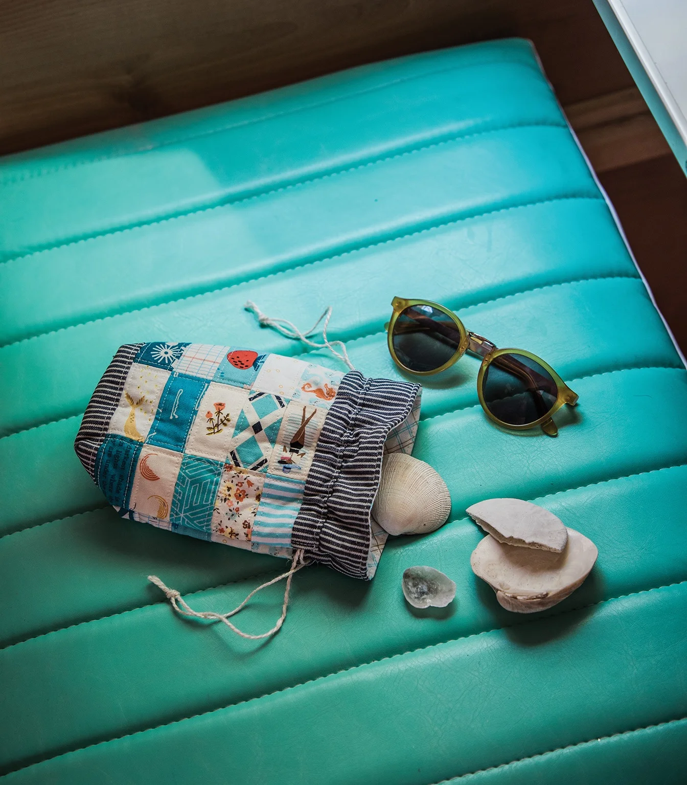
Beachcomber Drawstring Bag // Shot on a vinyl seat.

Beachcomber Drawstring Bag // Shot on a vinyl seat.

Serving multiple purposes, this vinyl seat was the perfect place to shoot this drawstring pouch. Indicating “road trip” as it is the bench seat inside a Shasta, adding an easy pop of color to the image, and creating some visual texture with the stitching on the seat, we loved using this surface as an easy way to tell a story.

While all of these projects would have looked great on our favorite weathered wood, the varied surfaces do more to tell the author’s story and really bring each of the projects to life.

What are some of your favorite surfaces to shoot on?

+
Kristy

Patchwork USA
Book Design + Photography: Page + Pixel
Publisher: Lucky Spool Media
Author: Heidi Staples


Light.

Being successful at photography, no matter what you are shooting, is all a matter of light.

Learning to harness it is a lifelong pursuit. See it, read it, bounce it, make it, love it, hate it. Become it's keeper.

35050768_10100171685583836_4398205098476437504_o.jpg

It doesn't matter what kind of camera you have, or what kind of gear you have. If you cannot harness light you cannot steadily make good photographs.

Even though I have been shooting for 10 years now, I regularly have my mind blown by something I didn't see before. It is one of my favorite things. Never ever stop watching, learning, trying.

Follow the light.

What are we all working on? Anyone want to talk about how good or bad light is being to them today?