
The thing about design is that it’s not always noticeable. We designers are in the background agonizing over things like a fonts point-size so that books are readable; left, center or right-aligned text; 95% black or 100% for the running font; making sure the footer text isn’t too close to the trim or too close to the text. But really, what sucks up most of our time is kerning.
Ahhhh! Kerning: the space in between the letters. The spaces that nobody notices, until they do.
I like to think that one of the most important parts of a designer’s job is to keep people focused on the task at hand by cleaning up, removing or adding, and making an experience feel beautiful and seamless. If a book or a space or a product gives you an easy, calm feeling, it is because of design (and there is probably some decent kerning going on).
Here’s a quick example of how I spent a good 20 minutes of my time as I was laying out the pages for Inspiring Improv by Nicholas Ball for Lucky Spool.
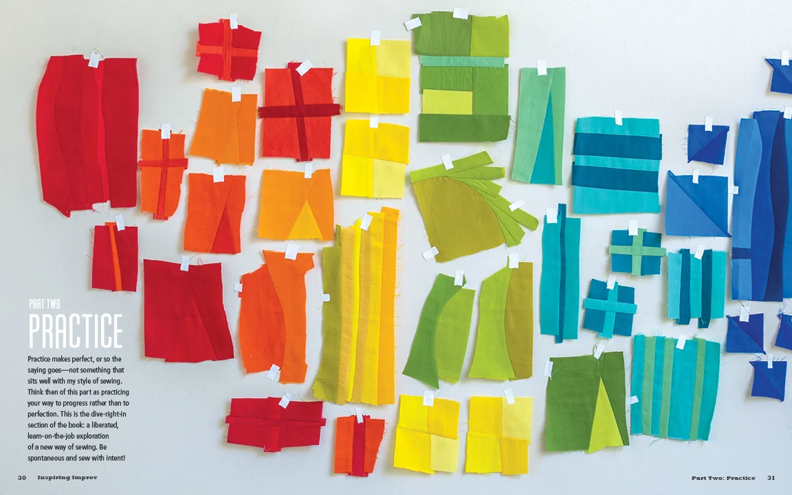
This is a looooovely image, isn’t it? Nick had the brilliant idea of taping all of his improv blocks up on the wall in color order. So pretty. I just want to keep my eyes moving amongst all of those inspiring blocks, but my eye gets pulled down to the bottom left of the page, right to that ragged line of text. What a bummer! Maybe it’s just me? But I couldn’t leave the page that way, so I justified the text, giving it a nice clean edge.

Ok, that’s a little better, at least I’m not attracted to the last line of the paragraph jutting out anymore! But now I’m distracted by how the text has a bunch of space between the words and letters in the first few sentences and then gets really bunched towards the end of the paragraph. AND I don’t like how close the last line is to the page number. Jeez Louise, I drive myself nuts!

There we go. So after spending a little time adjusting space between the words (tracking) and the individual letters (kerning), I’ve got the text to a nice, tidy block of unassuming text.
But I’ll be honest: now that I’ve spent some time writing up this post, I have grown fond of the ragged edge from the first image. The ragged edge does make sense with this particular image in that it feels organic and fluid, much like the improvisational blocks. That brings us to a different conundrum that book designers face: consistency. This is just one opener from the book, there are a few. As the designer, I was tasked with selecting the best design solution for the book as a whole, not for one spread at a time. In the end, the author and I decided that the justified text for the openers was the most successful choice for the overall design.
Welcome to the inside of my brain which is a constant back and forth of what-if’s and yeah-but’s!
What sorts of nitty-gritty does your job get you into?
+
Kristy
Inspiring Piecing
Book Design + Style Photography: Page + Pixel
Publisher: Lucky Spool Media
Author: Nicholas Ball