Play Fuels Creativity

PLAY: It's a practice that Nissa and I are committed to incorporating more of into our busy schedules. Who knew that we would have to schedule the time in our day-to-day to play? As a creative, it feels ridiculous—scheduling play-time— because it is the act of Play that got us here doing what we're doing. As a kid I would write and illustrate books for fun. I would make collages and was constantly reorganizing my bedroom...for fun! Not because I had to, not because someone was paying me to, but because I was able to get lost in the creativity and wasn't concerned about failure or doing it the right way or even if what I was doing would be considered "good" by anyone else. People need to play, especially creative people that earn a living using their creativity. Without it, I believe we risk the threat of our work becoming our job and that doesn't sound very fulfilling or sustainable.

Playing!

Playing!

About a month ago, we wrapped up a big, long photography project. We were feeling spent— we were out of ideas. Nissa nudged me and suggested that I come in to the studio ready to style a few little photos and take pictures of anything that I wanted. Whoa! The open-endedness was such a contrast to coming off of a project with a team of people giving me direction and feedback, it was almost overwhelming!

We gave ourselves a time limit of about 30 minutes (I love timers, they keep me motivated and focused). Nissa geeked out with her macro lens and I cut up random little bits of paper. It was a blast. During the play-shoot, we thought about how we could incorporate more play into our actual client projects without veering too far from the expectations. We also agreed to have a play session after every big project to recalibrate. As busy creative business-owners and mothers, it has now come to the point where the act of Play is a form of self-care.

NNB_5994.jpg
NNB_6035.jpg
NNB_6068.jpg

Curious: Do any of your schedule time for play? If so, do you play in the medium that you work in or do you get a kick out of experimenting?

Happy Play Day!

+
Kristy

* All photos in this post were edited with the BOLD Preset from the Page + Pixel Toolbox. Get your own set of presets here to streamline your photo-editing process.

Promote Your Classics

Purposely Improv designed by Jean Impey for Me + You.

Purposely Improv designed by Jean Impey for Me + You.

I've been listening to a lot of conversations about "too much". There are too many fabrics, too many patterns, too many books...just too much out there in our beloved quilting world. Everyone is trying to come up with something new at a pace so quick that the "new" is only new for a few months at most. We ARE talking about sewing, right? The antidote to our fast-paced lives? 

What if we all slowed down a bit, took a moment to look around and explore what we've all already put out there? On the one hand, wouldn't it be great if the industry could take a collective hiatus from churning out new-new-new for a set amount of time? On the other hand, no! That's not what being a creative business is all about. But there HAS to be something in between, no? It can't be so black and white/all or nothing/sink or swim.

During a conversation with a fellow Industry Professional—my official Quilt Market label—we were talking about how Page + Pixel could help with some marketing photography. Turns out, the turn-around time for fabric manufacturers to get new fabric promoted can be so incredibly tight that they don't even have time to spend on marketing it before the bolts hit the shops! Yikes! 

Realizing that not every design is going to be a best-seller it can be difficult to justify the cost of early promotion. Like book publishing, it seems that fabric needs a magic ball to tell what is going to stick and what won't.  

Enter the idea of Promoting Your Classics

Purposely Improv designed by Jean Impey for Me + You.

Purposely Improv designed by Jean Impey for Me + You.

Do you have a pattern design that you put out 5 years ago and it is still hanging on strong, getting a few downloads each month? Have a fabric design that gets reprinted over and over and is referred to as an "oldie but a goodie" or better yet, a "classic"?

What if you invested some resources into promoting your steady-eddies? Remake that pattern in more current fabrics and photograph it in a refreshed setting. Get that fabric line sewn up into some on-trend projects, get some new photos shot and reintroduce your customers to their forgotten favorite. With a little promotion, steady-eddies could become best-sellers!

We are here to help you refresh and repromote! Send us your updated quilts/bags/garments, we'll turn around a suite of updated images for you to use in your repromotion efforts. Why reinvent the wheel? If you've got it, flaunt it!

+
Kristy

Friends with an Eichler-Lover

As a photo stylist + photographer duo, there's nothing better than having friends with stunning homes. 2 years ago we were getting ready to launch Page + Pixel at our first Fall Quilt Market and we needed some show-stopping images to promote ourselves.

Our lovely friends Nancy Purvis, Mandy Leins  and Alison Schmidt hooked us up with some beautiful quilts to photograph and we spent the day at our super-stylish friend's home laughing, eating treats, talking about our favorite cocktails and taking some photos. 

Quilt by Nancy Purvis

Quilt by Nancy Purvis

Quilt by Mandy Leins

Quilt by Mandy Leins

Quilt by Nancy Purvis

Quilt by Nancy Purvis

Quilt Top Pieced by Janice Zeller Ryan, Blocks made by members of the LAMQG, Quilted by Melissa Richie

Quilt Top Pieced by Janice Zeller Ryan, Blocks made by members of the LAMQG, Quilted by Melissa Richie

Quilt made by Nancy Purvis

Quilt made by Nancy Purvis

Mary Peyton, thank you for opening your home to us! These are still some of our most-favorite images. 

xo,
Kristy

Promoting Yourself at Market

It's September, which means that Fall Quilt Market is NEXT MONTH!

File Sep 07, 2 11 07 PM.jpeg

Whether you're a seasoned QM attendee or you're a QM first-timer, you know that seeing all of the latest and greatest fabrics/products/books is exciting, but the reason to make the trek to Houston is to meet your people and network. While there's no doubt that your elevator pitch is on point, you're going to have to leave those people with something to remember you by because with 1000's of elevator-pitchers out there...need we say more?

Put together a dynamic, memorable postcard that keeps you fresh in people's minds long after you meet them on the show floor. Don't have time? Don't know where to start? Let us take it from here! 

2 Simple Options

250 Postcards ($600)
• 15-minute consultation, tell us what you're looking for!
• Custom styled photo of your quilt/bag/garment
• Postcard design/prepress/upload to printer
• 250 full-color, double-sided 5" x 7" postcards delivered to your door
• Hires PDF of your postcard design (in case you want to print more!)

500 Postcards ($800)
Everything included in the 250 option, plus:
• Hires JPG of your styled photo
• 250 more cards ;)

Timing

Send us your subjects by 9/22
Postcards will ship 10/13 (2-day Priority Mail)

Do you want to make your Quilt Market prep easier this year? Contact us and we'll get started on your postcard! Click the "How We Can Help You" link at the top of our page.

See you in Houston!
Kristy + Nissa


Recent Work//Hack That Tote!

When Nissa and I did the shot planning for this recently published Page + Pixel project, we were in a mood—ready to mix it up—and inspired by the title, Hack That Tote!, so we went for it. We used BOLD italic type, BIG diagonal lines and BRIGHT, saturated colors. All on one cover.

Because, why not?

Hack That Tote! by Mary Abreu, published by Stash Books

Hack That Tote! by Mary Abreu, published by Stash Books

The concept of this book is to start with a simple pattern and "hack" it to make a custom bag that suits you. Because of this customizable focus, all of the projects are very different with the purpose of appealing to many different tastes. We needed a way for all of these cool (and very different) bags to work together in this consolidated, book form. 

We loved the idea of "hacking the pattern". We were inspired to use a strong diagonal line throughout to mimic the idea of cutting-up-to-make-better, just as the readers are learning to do from Mary's instructions.

And if anything can unify, it's color. Instead of choosing a color family to work with, we decided that "bright" color was what we would use to connect the images. And the type: well, if we're using diagonal lines AND bright color, we couldn't have a light, whispery font, could we? 

Hack That Tote! was a truly collaborative project between Nissa and I. We planned the look of the photos with the book design in mind and when it was my turn to design the text, it was a blast to place type on top of these graphic, super-stylish images.  

So what do you guys think? Quiet, sun-lit shots are dreamy, sure...but every once in a while it's fun to punch it up, right?!

Kristy
DESIGN//STYLE

A Little Bit of Horn Tootin'

Sometimes we've just gotta toot our own horn because sometimes...SOMEtimes work gets recognized for the work that it is and that just feels so damn good. 

A few books that  Nissa and I worked together on at C&T Publishing were submitted to a North American book design competition, PubWest. Usually we place at least one book, sometimes none because the competition is pretty stiff. But this year, we swept the How To/Craft category! That has never happened! What is most exciting about this recognition is that the books that were selected were some of our favorite books to photograph and design. These books represent a true collaboration between the super-talented authors and the book team—what a thrill to be recognized.

Here are the winners:

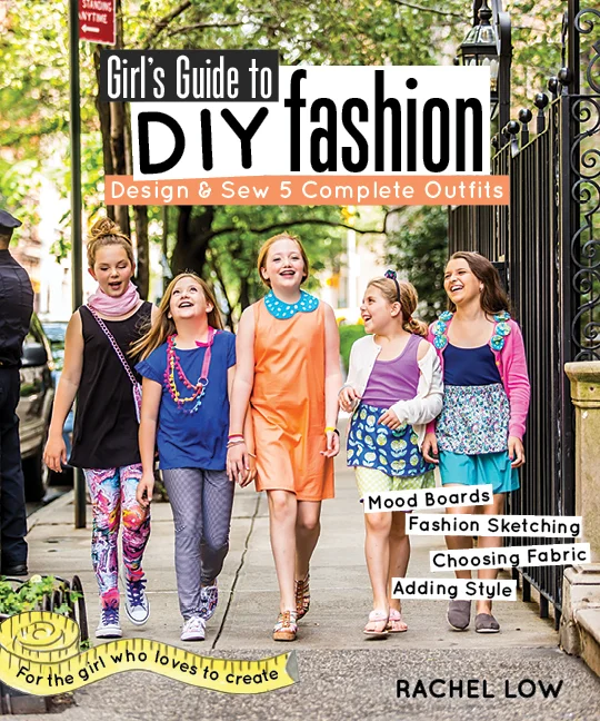
BRONZE: Girls' Guide to DIY Fashion by Rachel Low. Published by FunStitch Studio—an imprint of C&T Publishing

Shot completely on location on the streets and in the author's studio in New York City, this book was a total collaboration. The design needed be relevant to the 9-15 year old audience while presenting clear instructions for new sewers.

Cover/Book Design: Kristy ZachariasPhotography: Nissa Brehmer

Cover/Book Design: Kristy Zacharias
Photography: Nissa Brehmer

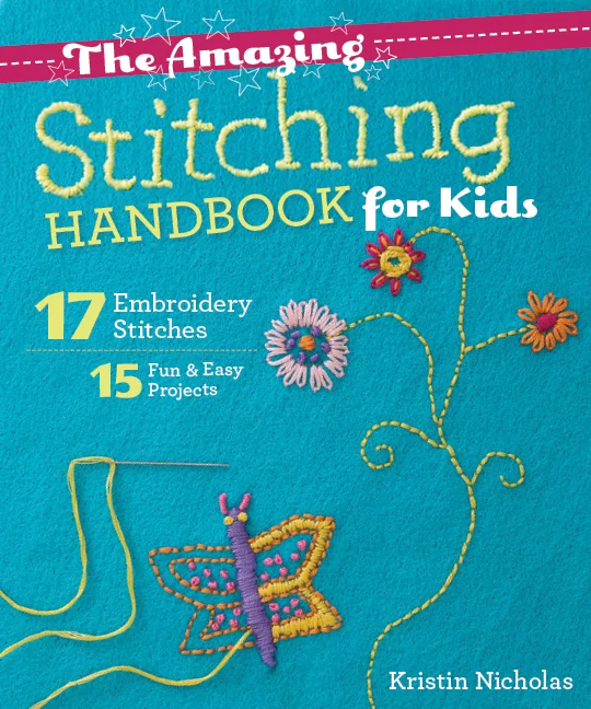
SILVER: The Amazing Stitching Handbook for Kids by Kristin Nicholas. Published by FunStitch Studio—an imprint of C&T Publishing.

It took 4 of us to get this cover created! Gailen and Joanna (2 awesome in-house embroidery whizzes) stitched up the cover in a child-like way, Nissa photographed the image and I designed the type. This type of in-process photo is always a favorite! 

Cover Design: Kristy ZachariasInterior Book Design: April MostekPhotography: Nissa Brehmer

Cover Design: Kristy Zacharias
Interior Book Design: April Mostek
Photography: Nissa Brehmer

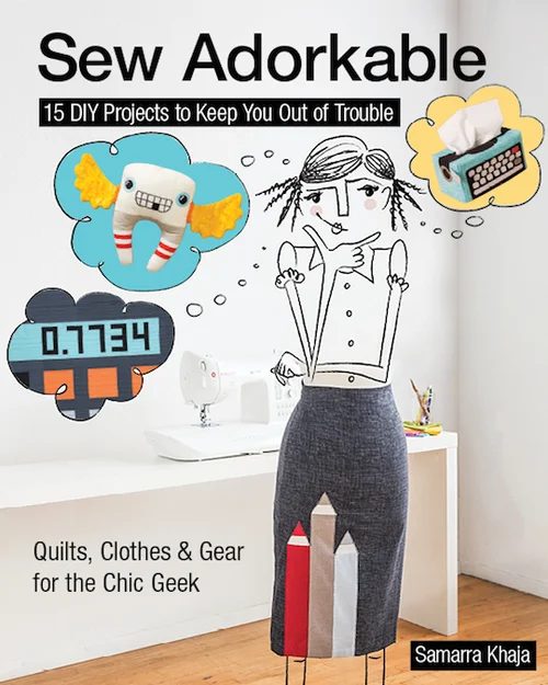
GOLD: Sew Adorkable by Samarra Khaja. Published by Stash Books—an imprint of C&T Publishing

This book was magic! Nissa and the author, Samarra, worked so closely together in order for Samarra's very clear vision for the book to work. Shooting in the studio, Nissa would set up scenarios with furniture and the projects while leaving spaces for Samarra to draw in her quirky characters and fill out the room. All I had to do was lay type over the beautiful images...this was truly a dream book.

Cover/Book Design: Kristy ZachariasPhotography: Nissa BrehmerIllustration: Samarra Khaja

Cover/Book Design: Kristy Zacharias
Photography: Nissa Brehmer
Illustration: Samarra Khaja

I love seeing people getting recognized for the work that they put out into the world. It's not always easy to go with your gut, to try something a little different/a little crazy/a little too (fill in the blank). But I'll tell you what, even if these books wouldn't have won a prize, we still would have loved them because we put our hearts (and guts) into them and at the end of the day, that's what feels the best. xo

Kristy
DESIGN//STYLE