When Nissa and I did the shot planning for this recently published Page + Pixel project, we were in a mood—ready to mix it up—and inspired by the title, Hack That Tote!, so we went for it. We used BOLD italic type, BIG diagonal lines and BRIGHT, saturated colors. All on one cover.
Because, why not?
Hack That Tote! by Mary Abreu, published by Stash Books
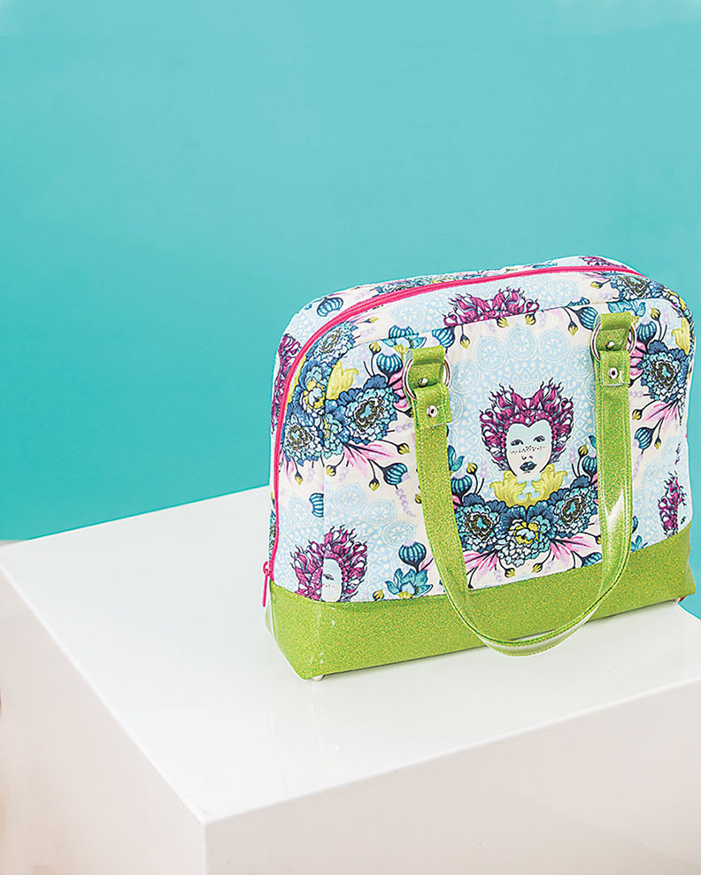
The concept of this book is to start with a simple pattern and "hack" it to make a custom bag that suits you. Because of this customizable focus, all of the projects are very different with the purpose of appealing to many different tastes. We needed a way for all of these cool (and very different) bags to work together in this consolidated, book form.
We loved the idea of "hacking the pattern". We were inspired to use a strong diagonal line throughout to mimic the idea of cutting-up-to-make-better, just as the readers are learning to do from Mary's instructions.
And if anything can unify, it's color. Instead of choosing a color family to work with, we decided that "bright" color was what we would use to connect the images. And the type: well, if we're using diagonal lines AND bright color, we couldn't have a light, whispery font, could we?
Hack That Tote! was a truly collaborative project between Nissa and I. We planned the look of the photos with the book design in mind and when it was my turn to design the text, it was a blast to place type on top of these graphic, super-stylish images.
So what do you guys think? Quiet, sun-lit shots are dreamy, sure...but every once in a while it's fun to punch it up, right?!
Kristy
DESIGN//STYLE


