I am always so humbled when you all send your quilts for us to photograph. The artistry and craftsmanship that go into making those beauties is astounding. And last week was no exception when we received a box from Angela Walters. Unable to resist waiting until the scheduled photoshoot, Nissa and I decided that we had better take out the quilts to...ahem...do some measurements and...you know...check out the fabric choices so that we could...*cough cough*...consider our lighting options. I mean, would you be able to resist?

Cover quilt of Angela Walters' latest pattern, Sprockets.
And speaking of beauties, how about Spring Quilt Market?! After everything that we saw via Instagram (wow!), Nissa and I got to talking and thought that some of you would need/want/love photos of those samples and projects that were made for the show. Knowing that you are all busy forging ahead with new ideas and business opportunities secured at market, we'd love to help you with those photos!
For one week, Page + Pixel is offering our Bulk Photography pricing for single quilts! Instead of needing to have 3 quilts finished and ready for photography, you can go ahead and send us that 1 from the show or that 1 that you just HAVE to have a photo of.

BOOK WITH US BEFORE JUNE 1** to receive the Bulk Photography rate.
**Quilts/projects for photography must be scheduled for delivery by July 20, 2016.
Go on, dig through that pile of quilts sitting over there and pull out the gems. We'll help you check some photos off of your list!
Kristy
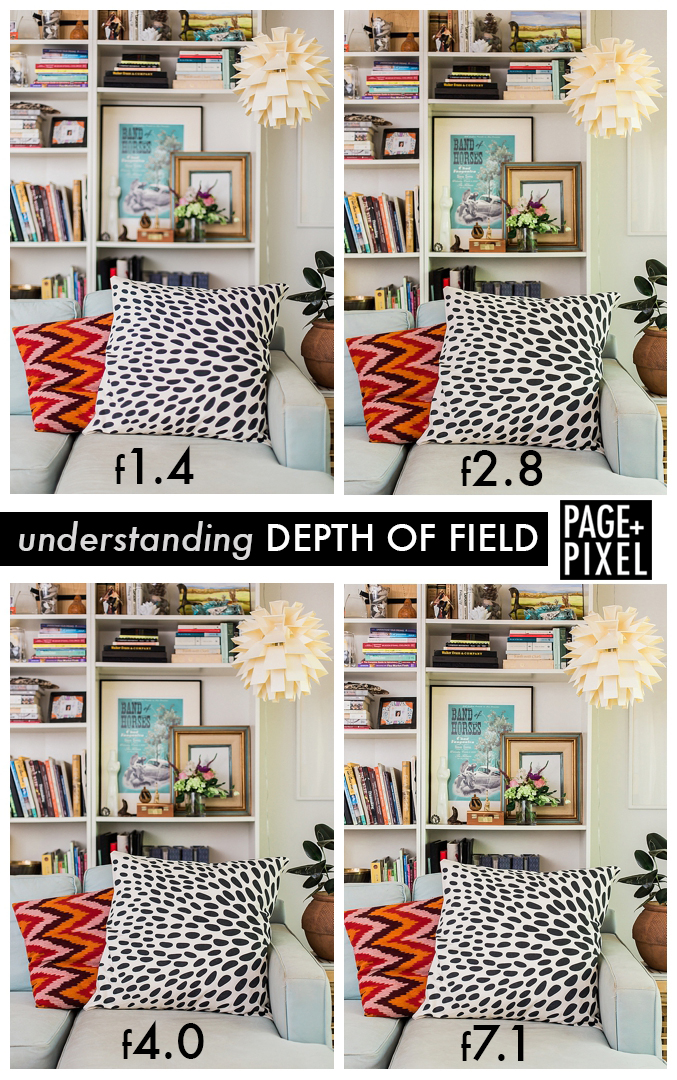
DESIGN//STYLE