Promoting Yourself at Market

It's September, which means that Fall Quilt Market is NEXT MONTH!

File Sep 07, 2 11 07 PM.jpeg

Whether you're a seasoned QM attendee or you're a QM first-timer, you know that seeing all of the latest and greatest fabrics/products/books is exciting, but the reason to make the trek to Houston is to meet your people and network. While there's no doubt that your elevator pitch is on point, you're going to have to leave those people with something to remember you by because with 1000's of elevator-pitchers out there...need we say more?

Put together a dynamic, memorable postcard that keeps you fresh in people's minds long after you meet them on the show floor. Don't have time? Don't know where to start? Let us take it from here! 

2 Simple Options

250 Postcards ($600)
• 15-minute consultation, tell us what you're looking for!
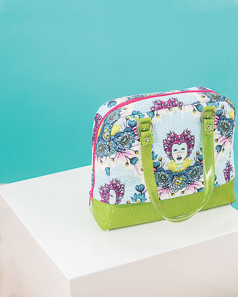
• Custom styled photo of your quilt/bag/garment
• Postcard design/prepress/upload to printer
• 250 full-color, double-sided 5" x 7" postcards delivered to your door
• Hires PDF of your postcard design (in case you want to print more!)

500 Postcards ($800)
Everything included in the 250 option, plus:
• Hires JPG of your styled photo
• 250 more cards ;)

Timing

Send us your subjects by 9/22
Postcards will ship 10/13 (2-day Priority Mail)

Do you want to make your Quilt Market prep easier this year? Contact us and we'll get started on your postcard! Click the "How We Can Help You" link at the top of our page.

See you in Houston!
Kristy + Nissa


Recent Work//Hack That Tote!

When Nissa and I did the shot planning for this recently published Page + Pixel project, we were in a mood—ready to mix it up—and inspired by the title, Hack That Tote!, so we went for it. We used BOLD italic type, BIG diagonal lines and BRIGHT, saturated colors. All on one cover.

Because, why not?

Hack That Tote! by Mary Abreu, published by Stash Books

Hack That Tote! by Mary Abreu, published by Stash Books

The concept of this book is to start with a simple pattern and "hack" it to make a custom bag that suits you. Because of this customizable focus, all of the projects are very different with the purpose of appealing to many different tastes. We needed a way for all of these cool (and very different) bags to work together in this consolidated, book form. 

We loved the idea of "hacking the pattern". We were inspired to use a strong diagonal line throughout to mimic the idea of cutting-up-to-make-better, just as the readers are learning to do from Mary's instructions.

And if anything can unify, it's color. Instead of choosing a color family to work with, we decided that "bright" color was what we would use to connect the images. And the type: well, if we're using diagonal lines AND bright color, we couldn't have a light, whispery font, could we? 

Hack That Tote! was a truly collaborative project between Nissa and I. We planned the look of the photos with the book design in mind and when it was my turn to design the text, it was a blast to place type on top of these graphic, super-stylish images.  

So what do you guys think? Quiet, sun-lit shots are dreamy, sure...but every once in a while it's fun to punch it up, right?!

Kristy
DESIGN//STYLE

A Little Bit of Horn Tootin'

Sometimes we've just gotta toot our own horn because sometimes...SOMEtimes work gets recognized for the work that it is and that just feels so damn good. 

A few books that  Nissa and I worked together on at C&T Publishing were submitted to a North American book design competition, PubWest. Usually we place at least one book, sometimes none because the competition is pretty stiff. But this year, we swept the How To/Craft category! That has never happened! What is most exciting about this recognition is that the books that were selected were some of our favorite books to photograph and design. These books represent a true collaboration between the super-talented authors and the book team—what a thrill to be recognized.

Here are the winners:

BRONZE: Girls' Guide to DIY Fashion by Rachel Low. Published by FunStitch Studio—an imprint of C&T Publishing

Shot completely on location on the streets and in the author's studio in New York City, this book was a total collaboration. The design needed be relevant to the 9-15 year old audience while presenting clear instructions for new sewers.

Cover/Book Design: Kristy ZachariasPhotography: Nissa Brehmer

Cover/Book Design: Kristy Zacharias
Photography: Nissa Brehmer

SILVER: The Amazing Stitching Handbook for Kids by Kristin Nicholas. Published by FunStitch Studio—an imprint of C&T Publishing.

It took 4 of us to get this cover created! Gailen and Joanna (2 awesome in-house embroidery whizzes) stitched up the cover in a child-like way, Nissa photographed the image and I designed the type. This type of in-process photo is always a favorite! 

Cover Design: Kristy ZachariasInterior Book Design: April MostekPhotography: Nissa Brehmer

Cover Design: Kristy Zacharias
Interior Book Design: April Mostek
Photography: Nissa Brehmer

GOLD: Sew Adorkable by Samarra Khaja. Published by Stash Books—an imprint of C&T Publishing

This book was magic! Nissa and the author, Samarra, worked so closely together in order for Samarra's very clear vision for the book to work. Shooting in the studio, Nissa would set up scenarios with furniture and the projects while leaving spaces for Samarra to draw in her quirky characters and fill out the room. All I had to do was lay type over the beautiful images...this was truly a dream book.

Cover/Book Design: Kristy ZachariasPhotography: Nissa BrehmerIllustration: Samarra Khaja

Cover/Book Design: Kristy Zacharias
Photography: Nissa Brehmer
Illustration: Samarra Khaja

I love seeing people getting recognized for the work that they put out into the world. It's not always easy to go with your gut, to try something a little different/a little crazy/a little too (fill in the blank). But I'll tell you what, even if these books wouldn't have won a prize, we still would have loved them because we put our hearts (and guts) into them and at the end of the day, that's what feels the best. xo

Kristy
DESIGN//STYLE

When Angela Walters Sends Us Quilts // Photo Promo

I am always so humbled when you all send your quilts for us to photograph. The artistry and craftsmanship that go into making those beauties is astounding. And last week was no exception when we received a box from Angela Walters. Unable to resist waiting until the scheduled photoshoot, Nissa and I decided that we had better take out the quilts to...ahem...do some measurements and...you know...check out the fabric choices so that we could...*cough cough*...consider our lighting options. I mean, would you be able to resist?

Cover quilt of Angela Walters' latest pattern, Sprockets.

Cover quilt of Angela Walters' latest pattern, Sprockets.

And speaking of beauties, how about Spring Quilt Market?! After everything that we saw via Instagram (wow!), Nissa and I got to talking and thought that some of you would need/want/love photos of those samples and projects that were made for the show. Knowing that you are all busy forging ahead with new ideas and business opportunities secured at market, we'd love to help you with those photos! 

For one week, Page + Pixel is offering our Bulk Photography pricing for single quilts! Instead of needing to have 3 quilts finished and ready for photography, you can go ahead and send us that 1 from the show or that 1 that you just HAVE to have a photo of.

BOOK WITH US BEFORE JUNE 1** to receive the Bulk Photography rate.
**Quilts/projects for photography must be scheduled for delivery by July 20, 2016.

Go on, dig through that pile of quilts sitting over there and pull out the gems. We'll help you check some photos off of your list!

Kristy
DESIGN//STYLE

Spring Quilt Market 2016: Nissa's Favorite Finds

Hey y'all - Nissa here. 

It's all over, folks! Spring Market is a wrap and while everyone heads back home to start dreaming up their next projects, I wanted to do a little roundup of  some of my favorite finds from Salt Lake City. 


MELODY MILLER, COTTON AND STEEL
 
I LOVE MELODY MILLER. I got to meet her for the first time at QuiltCon and was basically a giggly mess. Her fabric designs are just always right up my alley and I find myself drawn to them even when I don't know they are hers. I'm in love with Daisy Fields - Blue from her TRINKET line...I want to make a dress out of it for the summer. Her booth was simple but since I love her, she's always going to be on my favorites list (Hey Melody - call me anytime you need photos through another eye!) 


MAUREEN CRACKNELL
What I liked best about Maureen Cracknell's booth was the DRAMA. I love seeing color and a lot of it - she delivered. Her Spring 2016 collection Nightfall has a sophisticated whimsy feel and I'm in love with the owl prints. Looking forward to seeing more from her! 


ALEXANDER HENRY FABRICS
I saw a trend really surfacing at Market this year - vintage florals. My favorite print of Melody Miller's (above) was a vintage floral and I saw some really delicious offerings at Alexander Henry Fabric's booth as well.  My eye kept coming back to this fabulous display with dresses made by Sandra Johnson Designs, with on-point accessories and some retro decor.  I'm a modgirl, what can I say? This is all kinds of awesome. 


VIOLET CRAFT
Violet Craft is one of the most talented artists within the industry right now. Her use of color and design is second to none and I'm constantly impressed with what she's creating. We've all ooohed and aahhhhed at her animal pieces (the Elephant and Lion are just as amazing every time I see them) and landscape called Elevated Abstractions continues to make me swoon. I am immediately transported to a memory of driving from Portland, Oregon to Sisters, Oregon, past Mount Hood and down the valley toward the Three Sisters. (If you've never been there, do it.) 

Screen Shot 2016-05-23 at 10.13.38 AM.png


HEATHER JONES STUDIO
Heather Jones released her first collection for Robert Kaufmann for Spring 2016 and I am loving it. Color Dash has a really mod feel and it strikes me as several options that you could use easily as neutrals alongside busier patterned fabric. I love the handcrafted feel. Who is going to make some garments out of this line? 

What are some of your favorites from Spring Market? What were the trends you saw? What are you inspired by? 

We want you get a jumpstart on the inspiration that comes from an amazing time at QuiltMarket. What are you dreaming about getting done?  We can help you! We'll be sharing an exciting Limited Time Promotion TOMORROW, Wednesday May 25 in celebration of Spring Quilt Market 2016. There's only 156 days until Fall Market in Houston kicks off so let's get started on your projects now!  

Better Photography: Understanding Depth of Field When Photographing Your Work

Last week Kristy shared a post with you about Photo Styling and how MORE can be MORE when propping. 

This week I'm going to jump off her post and talk about how depth of field affects your image, especially when you're trying to create a beautiful shot while still keeping the attention directed at your quilt, pillow, bag, etc.

Depth of Field is a large concept that I can't completely teach you in this one small blog post. But what I'd like to do is give you guys a good idea of how you can quickly improve upon your images just by paying more attention to your camera's settings to make better use of depth of field in your images. (Don't worry, though - lots of amazing stuff is in the works at Page + Pixel, and soon enough I will be able to teach you about depth of field and many more things. Stay tuned!)  

WHAT IS DEPTH OF FIELD (DOF)?  When your lens focuses, it is focusing at one single point. However, there is an area both in front of and behind this focus point that will be sharp. The area that is well in focus and sharp is not fixed and changes depending on the aperture you select (fstop), how far away you are from your subject, and the distance of the lens you're using (which is affected by zooming in and out). It can be described as wide or shallow - wide meaning more is in focus, shallow meaning less is in focus. 

You're going to be using your aperture - or your fstop - as the primary way you adjust depth of field. Aperture settings can be confusing. Who the heck knows what those numbers mean?! You definitely don't need to. Keep it simple by remembering this: bigger number=bigger DOF. Smaller number=smaller DOF. 

These days, it's all the rage to shoot images that use a very narrow DOF.  This is achieved with lenses that have very wide apertures, like f2.8, f1.8, f1.4. We say they're dreamy - because much of the photo is blurred with thick, swirling color. The problem I often see, however, is that because depth of field is incorrectly understood, what should be in focus - your work - is lost because it's unsharp and the image is more about being dreamy and less about composition. 

On the OTHER hand, you'll get yourself in to trouble using a depth of field that is too wide, too. When everything is in focus, everything has the same level of importance. Sometimes, people who are afraid to shoot images that are not in focus enough go with super wide DOF to make sure that they don't mess up. 

I know, I know. Here comes Nissa, the Photo Police. 

But hear me out. 

I want your images to sell your work. You know - that amazing thing you just spent hours, days, weeks of your life designing, sewing and finishing. I want to see the fabric. The stitching. The texture. I also want to see an image that's engaging, and directs my eye to what I should be focusing on. 

You can make big changes and get better images easily by simply paying attention to your depth of field and making some small adjustments to your camera settings. 

Here's the image that Kristy shared with you last week. It's a simple pillow, so it looks great surrounded with beautiful busy and vibrant propping.  I've got to choose a depth of focus that's going to sell the pillow and make Kristy's styling choices work. For the sake of this blog post, I shot the photo using four different f-stops: f1.4, f2.8, f4.0 and f7.1. 

Before I tell you which of these images I chose, I want you to pick the one you would choose. Why would you choose it? What is working? 
 

Here's the one I chose: 
 

At f2.8, the pillow is beautifully in focus on all edges and it's sharp. The background is blurred enough that my eye is directed toward the pillow first. 

I liked the image at f1.4 because I felt that the pillow really stood out against a more blurred background. But what I didn't like is that the super narrow DOF made it so that the bottom half of the pillow was unsharp and was looking sloppy. That's a no-go. 

At f4.0 the background is too sharp and not sharp enough. Total eye confusion. And at 7.1, everything is sharp and in focus, which looks crisp but doesn't direct my attention enough toward the pillow. 

Really simple adjustments can help you guys make better use of depth of field and get better images today. Play around and try manipulating your settings to see what happens. 

I can't wait to see what you're going to make! 

Nissa
PHOTOGRAPHY