Design

TYPE TIPS // Font Friday

IG post (1).png

Have you tried out our CANVA Pattern Templates yet? They were designed specifically with pattern designers in mind and include a chart, cutting list, materials list and a few front/back cover options with spaces for all of the pattern requirements!

I’ve been thinking about how to make your CANVA experience a little less overwhelming so that you can get your patterns looking and feeling like your brand in no time. I thought a good place to start would be to take a look at what fonts CANVA has to offer and how to put them together in an interesting, effective and readable way.

If you have the free CANVA subscription, they offer a bunch of great fonts for you to use in your layouts. If you subscribe to CANVA Pro, you have access to even more! This week I put together 3 combinations of fonts offered in the Free version of CANVA. Have a look! Maybe you’ll be inspired to try these in your own layouts.


Clean + Modern Combo

FREE+Type+Combo+Samples.jpg

You can’t really go wrong with a heavy/condensed combo. Archivo Black makes for a great header as it is bold, readable and has clean lines. It looks great as a display but could also be placed as a heavy subhead . Combined with the slim condensed Archivo Narrow, the contrast makes navigating a lot of text easier.

I paired the Archivo fonts with Darker Grotesque as the body copy (the main text font) as it holds a similar modern feel and doesn’t take away from the more dramatic style of the two Archivo headers.


Happy + Light Combo

FREE+Type+Combo+Samples.jpg

Everyone loves a good script font, it’s just that finding a pretty AND readable one can be a challenge. For me, Amsterdam Two passes the “form and function” test for a header font: it’s got personality and can be read clearly at a larger point size.

I paired this script with the rounded sans serif Varela Round for the subhead to continue with the friendly vibe. The serifs on Solway, used as the body copy font, offer a bit more tradition to the combo.


Playful-but-not-silly Combo

FREE+Type+Combo+Samples.jpg

If you’re looking for a way to have fun in your layout, but not come across as too childlike, try auditioning a ball serif like the one in Playfair Display Black. Combined with the clean Barlow SemiCondensed subhead and readable Crimson Pro for the body copy, this font combo is like the perfect reverse mullet: Party in the front, business in the back.


This was fun! I hope it was helpful . Let’s try doing this again on another Friday. Are there any specific struggles you have when trying to nail down fonts for your pattern designs? Please let me know, I’d love to offer some solutions.

Until next time.

Happy Designing!
+ Kristy

TYPE TIPS // Measurements

While a post on formatting type isn’t as sexy as one on photography, it is just as useful to you self-publishers out there, so read up!

Today I’m giving you some simple InDesign tips on how to use typography to make your pattern instructions more functional and professional looking. I’ve noticed that there are 3 characters that often get overlooked by self-publishers and while the pattern instructions aren’t incorrect, readers have an easier time reading the text if some (or all!) of these tips are used. Let’s talk about inch marks, multiplication symbols and fractions.

Screen Shot 2020-05-13 at 4.58.50 PM.png

Inch Marks

Now, inch marks aren’t going to make or break your pattern copy, BUT if you’re looking to get your patterns looking polished, converting your quotation marks to inch marks is one easy way to do this.

Simply select the quotation mark and type and hold SHIFT + OPT + G on your keyboard. The quote mark will change to an inch mark.

PRO TIP: Do a Find/Replace and automate the conversion process. Be sure to double-check any text where you are intentionally using quotation marks, they will convert to inch marks if you go the Find/Replace route.

Screen Shot 2020-05-13 at 4.37.50 PM.png

Multiplication Symbol

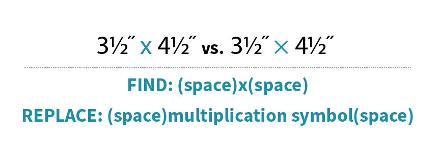
This one might seem really nit-picky, but hey, I’m a book designer, what do you expect?! One quick way I can tell if a pattern was thoughtfully designed is if multiplication symbols are used instead of a lowercase ‘x’. Not only does it give your layout some street cred, but using multiplication symbols help make the measurements easier to read.

Here’s how to do it: Highlight the ‘x’ In the text that you’d like to convert to a multiplication symbol. Then, go to the Glyphs panel and click the dropdown next to ‘Show’. Select ‘Math Symbols’, find the multiplication symbol and double-click to replace your ‘x’.

Screen Shot 2020-05-14 at 2.41.15 PM.png

You could do this manually throughout your layout, but why? Simply do a Find/Replace being sure to include the spaces before and after the Find/Replace otherwise you’ll just replace all of the x’s in your document with multiplication signs and that’s not cute, trust me.

Screen Shot 2020-05-13 at 4.42.44 PM.png

Fractions

Fractions: Everyone’s favorite kind of character to ignore. We all know we should format them, but they’re such a paaaaain! Right? Well, yeah, but they don’t have to be that big of a deal. Thankfully InDesign and OpenType fonts have made them easier to deal with.

First, confirm that the font you are using is an OpenType font. This will give you access to many type capabilities, including automatic fraction formatting. Once you know that you are working with an OpenType font, simply highlight the numbers and backslash that are included in the fraction. InDesign will convert the numbers to a numerator, fraction slash and denominator. I included a video because after years of hand-formatting, watching these fractions format before my eyes still feels like magic to me!

Screen Shot 2020-05-13 at 4.44.58 PM.png

I hope that I’ve shared some knowledge with you here! Of course there are other, even more automated ways to do some of these things and I’m headed in that direction. First, though, I like to show how to manually do these things because it’s just good knowledge to have…like driving a manual car, it’s good to know how to do it even though there is an easier way.

Happy designing!
+ Kristy

Canva Pattern Design Templates!

Am I the last person on earth to dip my toe in the magical layout world that is Canva? I wouldn't be surprised as I didn't own a cell phone until 2002!

As a book designer, I wasn't all that interested in Canva as I like to have a lot of control over what goes on on my pages...I mean, a LOT. So I've happily lived in my InDesign bubble over the years, styling and formatting my way to printed-book-bliss.

Over the past few years I’ve worked with individual pattern designers who own a Creative Cloud subscription and use Illustrator and Photoshop and thought, “Hey, what’s this InDesign…I should give it a shot since I am paying for it!”. So I worked up some InDesign templates for you all to use, to style and design your very own patterns! To me, that sounds like fun! But Nissa sat me down for a come to Jesus moment: People want fast and simple. Not everyone thinks setting type and putzing with fonts is fun like you do. Learn Canva, Kristy.

Got it.

Whoa, you guys! I spent some time digging around Canva and it’s fantastic! What a great way to create a cohesive, fluid branding presence. It’s all drag and drop, there are stock images you can use for free and tons of free fonts at your disposal! There are a ton of templates you can choose from, too. Best part? You can use it for free!

Only thing was, I didn’t see much by way of a template that would support a pattern layout. You need numbered lists, multi-level heads, a chart option, front/back cover options with spaces for a barcode and a large image and a materials list. Seems like using some of the templates they offer on the site would be fairly clunky for a pattern designer…so I created one with you all in mind!

5x8_Canva_screenshot.png

This is just the first of many templates that I have planned. I call it Minimal, because that’s what it is! There are a few simple design choices included but the images of your pattern will make this design shine. I’ve used a simple, readable, clean sans serif font and leave white space in the layout for a modern look.

There are 5.5” x 8.5” and an 8.5” x 11” options as those are the two most common pattern sizes and are easiest to print.

PatternTemplate_Preview.jpg
PatternTemplate_Preview2.jpg
PatternTemplate_Preview3.jpg
PatternTemplate_Preview_Table.jpg

With 23 different page designs including tables, bulleted lists, numbered lists and various ways to layout images, there is a ton of flexibility and lots of room for customization. All you need is a Canva* and Acrobat Reader account (to open the Page + Pixel template) and you’ll never start a layout with a blank slate again!

Keep checking back in as I will be adding more design styles. Is there something I’m missing? Please let me know! I’m eager to make something that you can all use to make your pattern-selling lives easier.

Happy designing!

+ Kristy

*Note: The download from our site is not affiliated with Canva. If you have any questions or concerns about the template, please contact us at info@pageandpixel.net

FREE DOWNLOAD // Design Your Summer

TenWeeks.jpg

Back by popular demand—or let’s face it, because I demanded it—it’s the 10 Weeks of Summer template.

Working families everywhere love to dread summer and it’s infamous 10 Weeks of unscheduled childcare. When I worked full-time at a publishing house, it was so difficult to fill up the 10 weeks in a cost-effective way without burning out my kids and going broke. Now that I’m on my own, it’s tempting to just say that my girls will be able to entertain themselves while I get work done in the middle of the day so we can save some $ and not over-schedule them….HA!!! I’ve been fooled before, it doesn’t work that way. I NEED TO GET MY KIDS OUT OF THE HOUSE for their sanity and mine. But I can’t just sign them up for camps every week, I can’t afford it.

Enter: my trusty template.

10Week_2019_template.jpg

Mapping out the weeks lets me visualize where the girls will be and helps me spread out the cost over the course of the summer. Let’s say I have Grandma come for Week 2, then I’ll sign them up for that cool camp (read: $$) for Week 3, followed by the super-affordable Girl Scout camp for Week 4. Maybe I do a kid-share for Week 5 & 6 with neighbors and then we go to WI for Week 7…you get the idea, right?

If you’ve got 1 or 2 kids, just print this bad boy out and start penciling in your plans (print a few out for 3 or more kids). It’s simple but really helps me get going on the planning and keeping on track.

So mash up some guac, crack open a Lacroix and get planning your 2019 summer!

+
Kristy