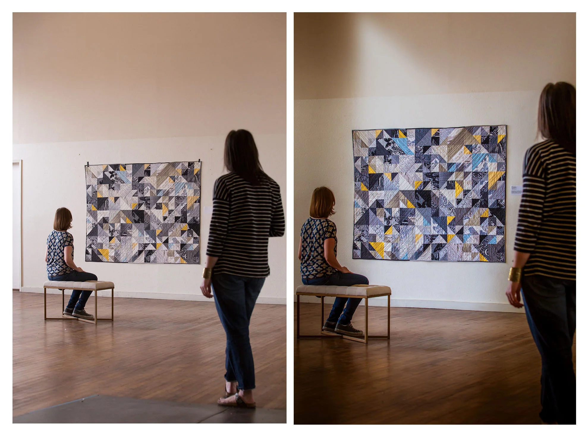
Last week Kristy shared a post with you about Photo Styling and how MORE can be MORE when propping.
This week I'm going to jump off her post and talk about how depth of field affects your image, especially when you're trying to create a beautiful shot while still keeping the attention directed at your quilt, pillow, bag, etc.
Depth of Field is a large concept that I can't completely teach you in this one small blog post. But what I'd like to do is give you guys a good idea of how you can quickly improve upon your images just by paying more attention to your camera's settings to make better use of depth of field in your images. (Don't worry, though - lots of amazing stuff is in the works at Page + Pixel, and soon enough I will be able to teach you about depth of field and many more things. Stay tuned!)
WHAT IS DEPTH OF FIELD (DOF)? When your lens focuses, it is focusing at one single point. However, there is an area both in front of and behind this focus point that will be sharp. The area that is well in focus and sharp is not fixed and changes depending on the aperture you select (fstop), how far away you are from your subject, and the distance of the lens you're using (which is affected by zooming in and out). It can be described as wide or shallow - wide meaning more is in focus, shallow meaning less is in focus.
You're going to be using your aperture - or your fstop - as the primary way you adjust depth of field. Aperture settings can be confusing. Who the heck knows what those numbers mean?! You definitely don't need to. Keep it simple by remembering this: bigger number=bigger DOF. Smaller number=smaller DOF.

These days, it's all the rage to shoot images that use a very narrow DOF. This is achieved with lenses that have very wide apertures, like f2.8, f1.8, f1.4. We say they're dreamy - because much of the photo is blurred with thick, swirling color. The problem I often see, however, is that because depth of field is incorrectly understood, what should be in focus - your work - is lost because it's unsharp and the image is more about being dreamy and less about composition.
On the OTHER hand, you'll get yourself in to trouble using a depth of field that is too wide, too. When everything is in focus, everything has the same level of importance. Sometimes, people who are afraid to shoot images that are not in focus enough go with super wide DOF to make sure that they don't mess up.
I know, I know. Here comes Nissa, the Photo Police.
But hear me out.
I want your images to sell your work. You know - that amazing thing you just spent hours, days, weeks of your life designing, sewing and finishing. I want to see the fabric. The stitching. The texture. I also want to see an image that's engaging, and directs my eye to what I should be focusing on.
You can make big changes and get better images easily by simply paying attention to your depth of field and making some small adjustments to your camera settings.
Here's the image that Kristy shared with you last week. It's a simple pillow, so it looks great surrounded with beautiful busy and vibrant propping. I've got to choose a depth of focus that's going to sell the pillow and make Kristy's styling choices work. For the sake of this blog post, I shot the photo using four different f-stops: f1.4, f2.8, f4.0 and f7.1.
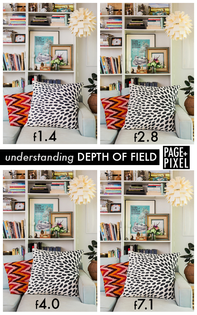
Before I tell you which of these images I chose, I want you to pick the one you would choose. Why would you choose it? What is working?
Here's the one I chose:
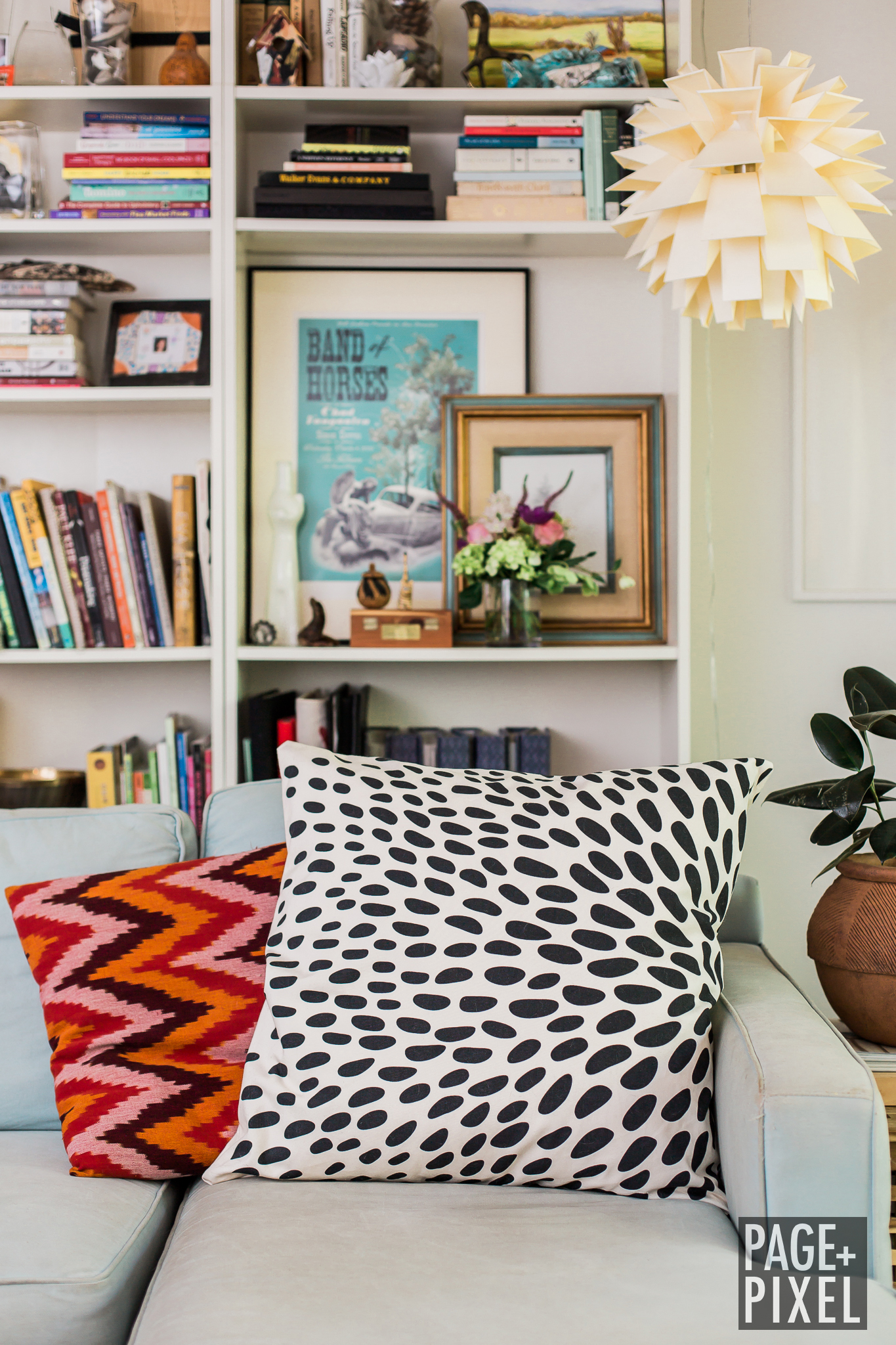
At f2.8, the pillow is beautifully in focus on all edges and it's sharp. The background is blurred enough that my eye is directed toward the pillow first.
I liked the image at f1.4 because I felt that the pillow really stood out against a more blurred background. But what I didn't like is that the super narrow DOF made it so that the bottom half of the pillow was unsharp and was looking sloppy. That's a no-go.
At f4.0 the background is too sharp and not sharp enough. Total eye confusion. And at 7.1, everything is sharp and in focus, which looks crisp but doesn't direct my attention enough toward the pillow.
Really simple adjustments can help you guys make better use of depth of field and get better images today. Play around and try manipulating your settings to see what happens.
I can't wait to see what you're going to make!
Nissa
PHOTOGRAPHY