Book Design

TYPE TIPS // Measurements

While a post on formatting type isn’t as sexy as one on photography, it is just as useful to you self-publishers out there, so read up!

Today I’m giving you some simple InDesign tips on how to use typography to make your pattern instructions more functional and professional looking. I’ve noticed that there are 3 characters that often get overlooked by self-publishers and while the pattern instructions aren’t incorrect, readers have an easier time reading the text if some (or all!) of these tips are used. Let’s talk about inch marks, multiplication symbols and fractions.

Screen Shot 2020-05-13 at 4.58.50 PM.png

Inch Marks

Now, inch marks aren’t going to make or break your pattern copy, BUT if you’re looking to get your patterns looking polished, converting your quotation marks to inch marks is one easy way to do this.

Simply select the quotation mark and type and hold SHIFT + OPT + G on your keyboard. The quote mark will change to an inch mark.

PRO TIP: Do a Find/Replace and automate the conversion process. Be sure to double-check any text where you are intentionally using quotation marks, they will convert to inch marks if you go the Find/Replace route.

Screen Shot 2020-05-13 at 4.37.50 PM.png

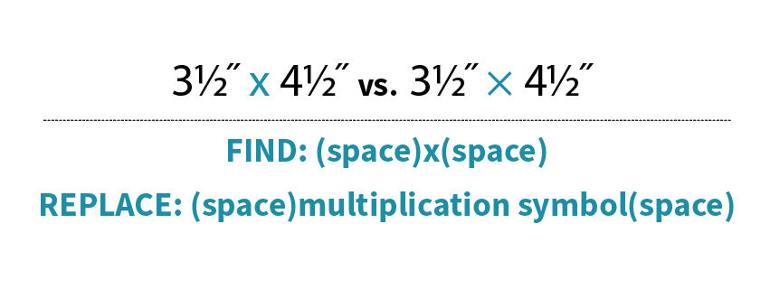
Multiplication Symbol

This one might seem really nit-picky, but hey, I’m a book designer, what do you expect?! One quick way I can tell if a pattern was thoughtfully designed is if multiplication symbols are used instead of a lowercase ‘x’. Not only does it give your layout some street cred, but using multiplication symbols help make the measurements easier to read.

Here’s how to do it: Highlight the ‘x’ In the text that you’d like to convert to a multiplication symbol. Then, go to the Glyphs panel and click the dropdown next to ‘Show’. Select ‘Math Symbols’, find the multiplication symbol and double-click to replace your ‘x’.

Screen Shot 2020-05-14 at 2.41.15 PM.png

You could do this manually throughout your layout, but why? Simply do a Find/Replace being sure to include the spaces before and after the Find/Replace otherwise you’ll just replace all of the x’s in your document with multiplication signs and that’s not cute, trust me.

Screen Shot 2020-05-13 at 4.42.44 PM.png

Fractions

Fractions: Everyone’s favorite kind of character to ignore. We all know we should format them, but they’re such a paaaaain! Right? Well, yeah, but they don’t have to be that big of a deal. Thankfully InDesign and OpenType fonts have made them easier to deal with.

First, confirm that the font you are using is an OpenType font. This will give you access to many type capabilities, including automatic fraction formatting. Once you know that you are working with an OpenType font, simply highlight the numbers and backslash that are included in the fraction. InDesign will convert the numbers to a numerator, fraction slash and denominator. I included a video because after years of hand-formatting, watching these fractions format before my eyes still feels like magic to me!

Screen Shot 2020-05-13 at 4.44.58 PM.png

I hope that I’ve shared some knowledge with you here! Of course there are other, even more automated ways to do some of these things and I’m headed in that direction. First, though, I like to show how to manually do these things because it’s just good knowledge to have…like driving a manual car, it’s good to know how to do it even though there is an easier way.

Happy designing!
+ Kristy

RECENT WORK: Patchwork Lab: Gemology

Publishing books is a sneaky business. By the time the book is released and ready to sell, the book team will have already spent nearly a year working on the project! That’s a whole year of working on something super-cool and not being able to share what I’m working on. That may explain the blog posts coming in fits and spurts—or maybe it’s because I get distracted and forget about posting. I am a xenial, afterall: half-analog/half-digital. That said, a really fun book has just reached the hands of the author, so I get to be digital today ;)

Patchwork Lab: Gemology by Andra Tsang Jackson for Lucky Spool was a pleasure to design. Her graphic paper-pieced gemstones and beautiful color sense give this book a sophistication that graphic designers like me dream of working with.

LSID0051_Gemology_frontcover.jpg

+
Kristy

Project: Patchwork Lab: Gemology
Author: Andrea Tsang Jackson
Publisher: Lucky Spool
Book Design: Page + Pixel
Photography: Holly DeGroot

OTP // Mini Masterpieces

A few weeks ago, Mini Masterpieces by Alyce Blythe for Lucky Spool was sent off-to-print. What a fun book to work on! The quilts on this book cover are not photoshopped together, they are the actual quilts hung on a wall. Aren’t they great? They really are minis.

LSID0048_Mini_frontcover.jpg

Designing and photographing a cover this way appears like it should be pretty quick and simple (Spoiler: the more simple the layout, the more challenging it was to put together). There were endless configurations that we could place these quilts in, it seriously began feeling like a giant game of tetris! Playing with the shapes and balancing the color, considering where the title would be placed and which quilts worked best together…I’m kicking myself for not recording a time lapse of this set up.

Composing the image while keeping the text in mind is my favorite way to design. I suppose it’s a good thing that I know a great photographer.

+
Kristy

Project: Mini Masterpieces
Author: Alyce Blythe
Publisher: Lucky Spool
Book Design + Photography: Page + Pixel

National Craft Book Week

Here is just a small sampling of some of the #craftbooks we have worked on over the years. Between production work, book design, cover design, photography, art direction...we’ve collaborated and contributed to hundreds of craft-sewing books and have loved working on every one of them.

ACS_1502.JPG


As a book designer, I’m not sure of a better job out there for me. I get to work with artists every day and am always learning something new and am constantly being inspired. To be able to contribute to the sewing and quilting community in this way is an honor and I do not take it for granted.

Here’s to #nationacraftbookweek and ALL of the publishers, authors, editors, photographers, illustrators and designers that are keeping print alive and thriving.

+ Kristy

DESIGN ARCHIVES // Brave New Quilts

I’ve been fortunate to be designing books for the craft publishing industry since about 2004. And for 3 years before that, I was a Production Assistant getting the books ready for print. Needless to say, I’ve worked on a lot…A LOT…of quiltmaking books. And while I find myself extremely lucky to have worked on each and every one of them—even the tough ones!—I do have my favorites. Books become my favorites for a whole host of reasons: a connection with the author, the quilts really inspired me, the book design was a fun challenge, the photoshoot was a blast.

And sometimes, it’s just all of it: the content, the author, the book team, the design, the quilts. Brave New Quilts by the late Kathreen Ricketson is one of those books.

10935D.jpg

I remember sitting in the focus meeting for this book before it had a title and I was so very excited throughout the entire 90 minutes. I couldn’t get over how wonderful the concept was for this book: quilt projects inspired by 20th century art! From the minute the editorial and marketing team concepted the title, I was in love.

Ricketson_spread2.jpg

Working with Kathreen was a pleasure. She and her family were busy on an epic year-long road trip during the book design and production phase and she was very generous with me as a young designer—open to my unconventional layouts and layering of images. Her one comment about the cover design was, “That’s some big type.” I couldn’t disagree.

10935_07_BrightFuture_ArtDeco 2.jpg

The project was very personal to Kathreen. She and her husband shot the photos in their home, with their children in some of the images and her drawings, sketches and notes are sprinkled throughout the layout. This book has a heart and soul and I felt it as I was laying out each page.

10935_05_ClearCut_Bauhaus 1.jpg

Back in 2013, when I was in the middle of finalizing the book to send to the printer, I received an email saying that Kathreen and her husband had died in a tragic accident while on their trip. This incredibly heartbreaking news still stirs me up a bit as I think of it today. Just as flipping through her book still inspires me to play and think outside of the norm when I work.

I am grateful for Kathreen’s influence on me as a designer and her book will always be one of my favorites. Together we pushed what a typical quilt book cover looked like and gave readers something new to consider as they read and flipped through the pages. Her ability to let go and trust another creative with her work has stayed with me and I try to practice that with others that I work with. Thank you, Kathreen. You truly are missed.

Who has inspired you in your work? Who has made a lasting impression?

+ Kristy

Brave New Quilts
Book Design: Kristy Zacharias (pre-P+P)
Publisher: Stash Books
Author: Kathreen Ricketson

Nice Kern-Job

The thing about design is that it’s not always noticeable. We designers are in the background agonizing over things like a fonts point-size so that books are readable; left, center or right-aligned text; 95% black or 100% for the running font; making sure the footer text isn’t too close to the trim or too close to the text. But really, what sucks up most of our time is kerning.

Ahhhh! Kerning: the space in between the letters. The spaces that nobody notices, until they do.

I like to think that one of the most important parts of a designer’s job is to keep people focused on the task at hand by cleaning up, removing or adding, and making an experience feel beautiful and seamless. If a book or a space or a product gives you an easy, calm feeling, it is because of design (and there is probably some decent kerning going on).

Here’s a quick example of how I spent a good 20 minutes of my time as I was laying out the pages for Inspiring Improv by Nicholas Ball for Lucky Spool.

LS0046_Improv_Design_pg30a.jpg

This is a looooovely image, isn’t it? Nick had the brilliant idea of taping all of his improv blocks up on the wall in color order. So pretty. I just want to keep my eyes moving amongst all of those inspiring blocks, but my eye gets pulled down to the bottom left of the page, right to that ragged line of text. What a bummer! Maybe it’s just me? But I couldn’t leave the page that way, so I justified the text, giving it a nice clean edge.

LS0046_Improv_Design_pg30b.jpg

Ok, that’s a little better, at least I’m not attracted to the last line of the paragraph jutting out anymore! But now I’m distracted by how the text has a bunch of space between the words and letters in the first few sentences and then gets really bunched towards the end of the paragraph. AND I don’t like how close the last line is to the page number. Jeez Louise, I drive myself nuts!

LS0046_Improv_Design_pg30.jpg

There we go. So after spending a little time adjusting space between the words (tracking) and the individual letters (kerning), I’ve got the text to a nice, tidy block of unassuming text.

But I’ll be honest: now that I’ve spent some time writing up this post, I have grown fond of the ragged edge from the first image. The ragged edge does make sense with this particular image in that it feels organic and fluid, much like the improvisational blocks. That brings us to a different conundrum that book designers face: consistency. This is just one opener from the book, there are a few. As the designer, I was tasked with selecting the best design solution for the book as a whole, not for one spread at a time. In the end, the author and I decided that the justified text for the openers was the most successful choice for the overall design.

Welcome to the inside of my brain which is a constant back and forth of what-if’s and yeah-but’s!

What sorts of nitty-gritty does your job get you into?

+
Kristy

Inspiring Piecing
Book Design + Style Photography: Page + Pixel
Publisher: Lucky Spool Media
Author: Nicholas Ball