Favorite Quilt

While 2021 is nearly over, 2020 hasn’t let go of me quite yet.

During our time home together, with only each other, I declared that we would make a family quilt. Meaning, we would all select the fabrics and the design together and everyone would contribute to sewing. We’d be left with a meaningful remnant from that extraordinary time—our Pandemic Quilt.

Ha! Who else out there has teenage daughters?

A bit pouty, but still determined, I decided I would forge ahead on my own with a quiltmaking journey that included ZERO perfection and ONLY enjoyment.

The result was a slow, meandering project that included ONLY the aspects of quilting that I love. Here’s a list of everything that makes this my Favorite Quilt:

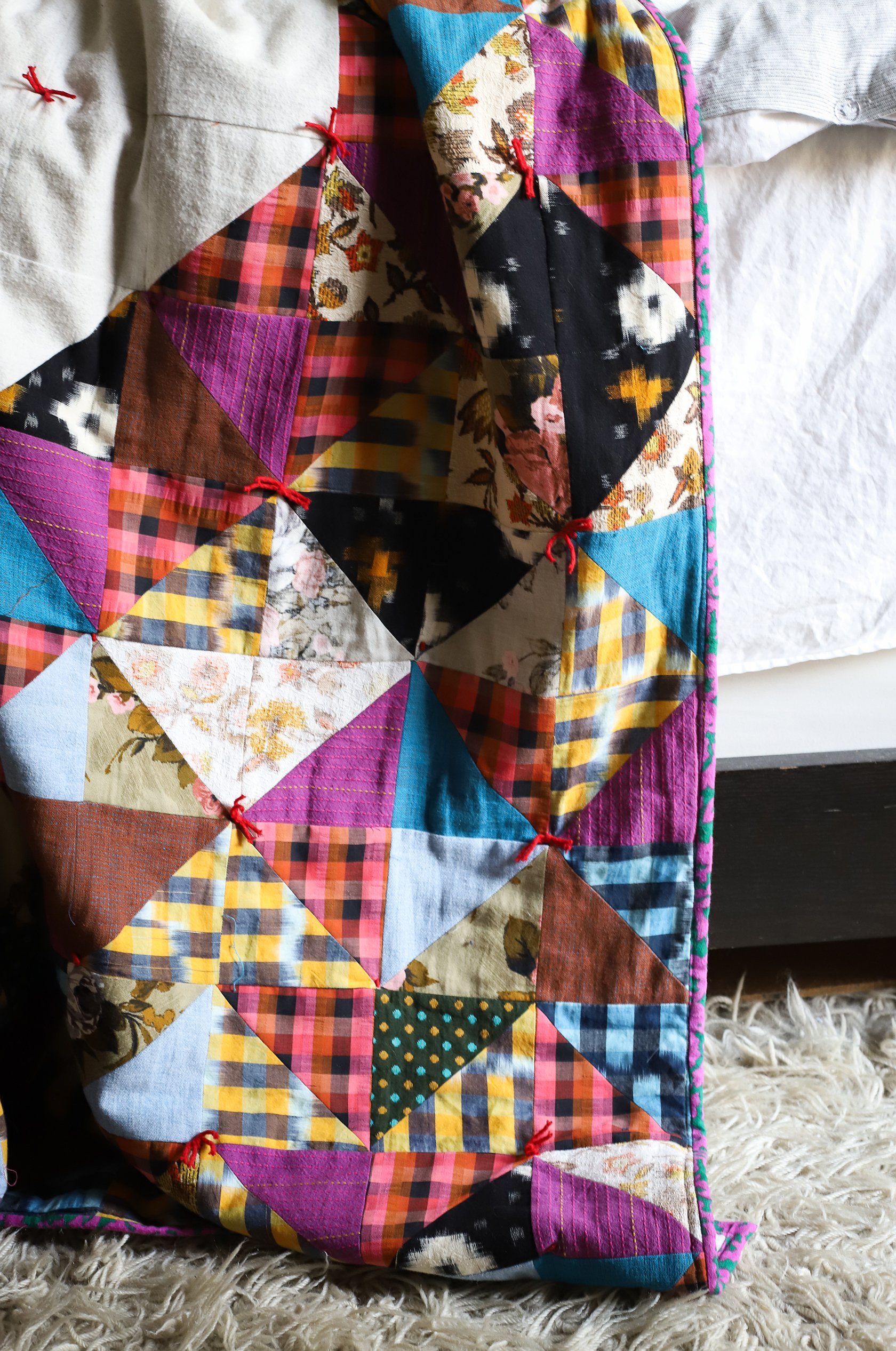
  • The heart is my favorite symbol, so much my favorite that the quilt is double-sided!

  • HSTs are my favorite block.

  • Inspired by Nicole of Modern Handcraft, I riffed off the idea of her delightful (and generously free!) HST heart pattern. Thank you, Nicole!

  • I used my favorite fabric—an Anna Maria Horner bundle purchased at the Savannah QuiltCon show.

  • All other fabric was cut from favorite thrifted textiles or gifted vintage textiles from my godmother and neighbor.

  • I used my favorite Denyse Schmidt “Paper bag” method to randomly select the fabric for my blocks.

  • The quilt is hand-tied—it was simple to do, the quilt is soft and drapey and I am reminded of my favorite childhood hand-tied blankie.

  • This quilt is a gift to my favorite people, including myself.

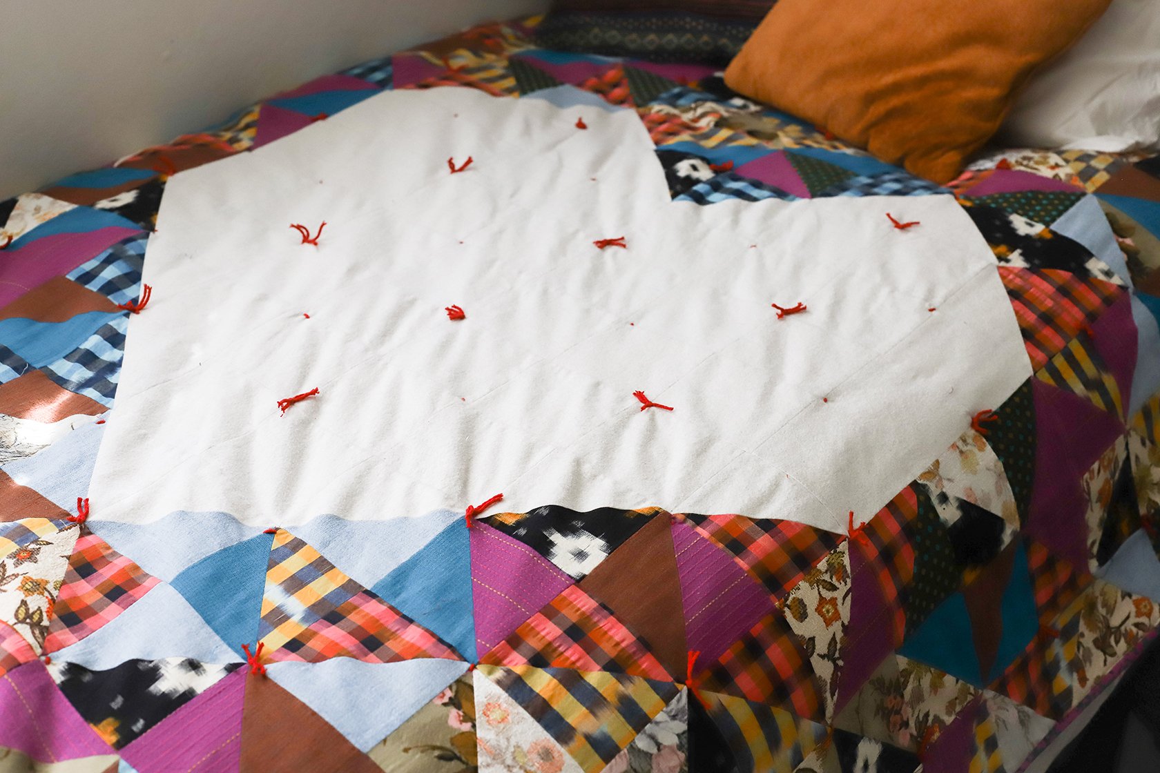
This quilt is also about gentleness. I guarantee that none of the points match up. Tying is not consistent, there are threads everywhere and the binding corners are clunky. Each time I found myself getting tight in the shoulders when I saw a mistake, I consciously took a breath and reminded myself it was okay. Happily pullng fabrics that looked a little crazy together was so refreshing. I imagine it’s how a little kid feels when they are painting—slapping colors together because they like them, not because they follow some theory of beauty.

I’m so happy to have finally made my family a quilt of our own. It’s been 15 years since I’ve started making quilts for other people’s babies or for guilds. It took a global pandemic for me to slow down enough and to be gentle enough to make one for us! I think I’ve rewired my perfectionistic brain while working on this celebration of all things happy. Thank you to this incredible community for your inspiration!

XO,

Kristy

RECENT WORK // March Hare Pattern Design

Last year, around this time, I received an inquiry about our pattern design service. As usual, I set up a call with the inquiring person and we talked about how I can help them get their pattern out in to the world. Sounds easy enough, right? They call me, I tell them what I need from them in order to design the pattern, they send everything over and voíla! The pattern is ready to be published!

Sure, sounds simple, but there are looooots of steps to be taken in that “they send everything over” part.

That’s why a lot of the times I don’t hear back after our initial conversation. Designing a pattern isn’t easy, folks! Writing the text, editing the text, drawing up the technical illustrations, oh…and making the actual quilt so it can be photographed, that’s also important.

So I had a lovely conversation with this curious prospective client about what goes into designing a pattern and she took notes, asked thoughtful questions and said, “I’ll get back to you, I’ve got some thinking to do.” I understood. And I also realized that I may not hear back (see the above paragraph).

To my suprise, nearly one year later, I received a call from Amy Robertson of Dappled Things by Amy, she was ready to get her pattern out into the world! Surprised and impressed with her perseverance, I was thrilled to be working with her on her debut pattern, March Hare.

I’m late in posting about this pattern, but Amy had it ready to go by mid-March in order to celebrate this timely and whimsical design. I think it helps us creatives to have a concrete goal to work towards or else we can get distracted with all of our ideas! Using March as her deadline was smart and it kept Amy on track.

One of the questions I ask prospective pattern clients is if they plan on publishing their patterns in print or PDF form. The idea is to make using the pattern as simple as possible for readers AND how about taking advantage of opportunities for passive revenue?! With Amy’s PDF pattern download, we included links to her Etsy shop in her materials list. This saved readers the time of looking up materials they needed to purchase AND it gave Amy the opportunity for product sales.

DappledThings_MarchHare_Pattern5.jpg

It’s always fun sharing recent work of my own. It’s double the fun to share someone else’s along the way. Congratulations, Amy, on your sweet new pattern!

Have questions about designing a pattern of your own? Here’s some info about working with us. Or maybe you’re ready to do the layout on your own! Our DIY Shop has InDesign and Canva pattern templates to help you get started with your layout along with an awesome photo editing preset to bump up the quality of your photos.

Happy designing!

+ Kristy


Project: March Hare Custom Pattern Design
Quilt Designer: Amy Robertson, Dappled Things by Amy


TYPE TIPS // Font Friday

IG post (1).png

Have you tried out our CANVA Pattern Templates yet? They were designed specifically with pattern designers in mind and include a chart, cutting list, materials list and a few front/back cover options with spaces for all of the pattern requirements!

I’ve been thinking about how to make your CANVA experience a little less overwhelming so that you can get your patterns looking and feeling like your brand in no time. I thought a good place to start would be to take a look at what fonts CANVA has to offer and how to put them together in an interesting, effective and readable way.

If you have the free CANVA subscription, they offer a bunch of great fonts for you to use in your layouts. If you subscribe to CANVA Pro, you have access to even more! This week I put together 3 combinations of fonts offered in the Free version of CANVA. Have a look! Maybe you’ll be inspired to try these in your own layouts.


Clean + Modern Combo

FREE+Type+Combo+Samples.jpg

You can’t really go wrong with a heavy/condensed combo. Archivo Black makes for a great header as it is bold, readable and has clean lines. It looks great as a display but could also be placed as a heavy subhead . Combined with the slim condensed Archivo Narrow, the contrast makes navigating a lot of text easier.

I paired the Archivo fonts with Darker Grotesque as the body copy (the main text font) as it holds a similar modern feel and doesn’t take away from the more dramatic style of the two Archivo headers.


Happy + Light Combo

FREE+Type+Combo+Samples.jpg

Everyone loves a good script font, it’s just that finding a pretty AND readable one can be a challenge. For me, Amsterdam Two passes the “form and function” test for a header font: it’s got personality and can be read clearly at a larger point size.

I paired this script with the rounded sans serif Varela Round for the subhead to continue with the friendly vibe. The serifs on Solway, used as the body copy font, offer a bit more tradition to the combo.


Playful-but-not-silly Combo

FREE+Type+Combo+Samples.jpg

If you’re looking for a way to have fun in your layout, but not come across as too childlike, try auditioning a ball serif like the one in Playfair Display Black. Combined with the clean Barlow SemiCondensed subhead and readable Crimson Pro for the body copy, this font combo is like the perfect reverse mullet: Party in the front, business in the back.


This was fun! I hope it was helpful . Let’s try doing this again on another Friday. Are there any specific struggles you have when trying to nail down fonts for your pattern designs? Please let me know, I’d love to offer some solutions.

Until next time.

Happy Designing!
+ Kristy

CANVA TIPS // Rotating a Page

Are you self-publishing your patterns? Read: designing, writing, photographing, tech-editing, laying out pattern instructions and printing/stuffing physical patterns from home?

With feedback from self-pub designers (thank you, btw!), I’ve added a bonus printable front/back cover page to our 8.5” x 11” and A4 CANVA templates so that you can easily print your entire pattern from home. Print out the individual pattern sheets, fold them in half and stuff between the folded front/back cover.

RotatedCanvaPage.png

While CANVA makes life easier in some ways, we need to find sneaky little work arounds for others. Watch me show you how to make this bonus template page work for you. Fair warning: I need to up my video skills, but watch it for the info!

If you have any other questions or ways that you feel the template could work better for you, please reach out!

Happy Designing!
+ Kristy

kristy@pageandpixel.net


TYPE TIPS // Measurements

While a post on formatting type isn’t as sexy as one on photography, it is just as useful to you self-publishers out there, so read up!

Today I’m giving you some simple InDesign tips on how to use typography to make your pattern instructions more functional and professional looking. I’ve noticed that there are 3 characters that often get overlooked by self-publishers and while the pattern instructions aren’t incorrect, readers have an easier time reading the text if some (or all!) of these tips are used. Let’s talk about inch marks, multiplication symbols and fractions.

Screen Shot 2020-05-13 at 4.58.50 PM.png

Inch Marks

Now, inch marks aren’t going to make or break your pattern copy, BUT if you’re looking to get your patterns looking polished, converting your quotation marks to inch marks is one easy way to do this.

Simply select the quotation mark and type and hold SHIFT + OPT + G on your keyboard. The quote mark will change to an inch mark.

PRO TIP: Do a Find/Replace and automate the conversion process. Be sure to double-check any text where you are intentionally using quotation marks, they will convert to inch marks if you go the Find/Replace route.

Screen Shot 2020-05-13 at 4.37.50 PM.png

Multiplication Symbol

This one might seem really nit-picky, but hey, I’m a book designer, what do you expect?! One quick way I can tell if a pattern was thoughtfully designed is if multiplication symbols are used instead of a lowercase ‘x’. Not only does it give your layout some street cred, but using multiplication symbols help make the measurements easier to read.

Here’s how to do it: Highlight the ‘x’ In the text that you’d like to convert to a multiplication symbol. Then, go to the Glyphs panel and click the dropdown next to ‘Show’. Select ‘Math Symbols’, find the multiplication symbol and double-click to replace your ‘x’.

Screen Shot 2020-05-14 at 2.41.15 PM.png

You could do this manually throughout your layout, but why? Simply do a Find/Replace being sure to include the spaces before and after the Find/Replace otherwise you’ll just replace all of the x’s in your document with multiplication signs and that’s not cute, trust me.

Screen Shot 2020-05-13 at 4.42.44 PM.png

Fractions

Fractions: Everyone’s favorite kind of character to ignore. We all know we should format them, but they’re such a paaaaain! Right? Well, yeah, but they don’t have to be that big of a deal. Thankfully InDesign and OpenType fonts have made them easier to deal with.

First, confirm that the font you are using is an OpenType font. This will give you access to many type capabilities, including automatic fraction formatting. Once you know that you are working with an OpenType font, simply highlight the numbers and backslash that are included in the fraction. InDesign will convert the numbers to a numerator, fraction slash and denominator. I included a video because after years of hand-formatting, watching these fractions format before my eyes still feels like magic to me!

Screen Shot 2020-05-13 at 4.44.58 PM.png

I hope that I’ve shared some knowledge with you here! Of course there are other, even more automated ways to do some of these things and I’m headed in that direction. First, though, I like to show how to manually do these things because it’s just good knowledge to have…like driving a manual car, it’s good to know how to do it even though there is an easier way.

Happy designing!
+ Kristy