I’ve been fortunate to be designing books for the craft publishing industry since about 2004. And for 3 years before that, I was a Production Assistant getting the books ready for print. Needless to say, I’ve worked on a lot…A LOT…of quiltmaking books. And while I find myself extremely lucky to have worked on each and every one of them—even the tough ones!—I do have my favorites. Books become my favorites for a whole host of reasons: a connection with the author, the quilts really inspired me, the book design was a fun challenge, the photoshoot was a blast.
And sometimes, it’s just all of it: the content, the author, the book team, the design, the quilts. Brave New Quilts by the late Kathreen Ricketson is one of those books.

I remember sitting in the focus meeting for this book before it had a title and I was so very excited throughout the entire 90 minutes. I couldn’t get over how wonderful the concept was for this book: quilt projects inspired by 20th century art! From the minute the editorial and marketing team concepted the title, I was in love.

Working with Kathreen was a pleasure. She and her family were busy on an epic year-long road trip during the book design and production phase and she was very generous with me as a young designer—open to my unconventional layouts and layering of images. Her one comment about the cover design was, “That’s some big type.” I couldn’t disagree.
The project was very personal to Kathreen. She and her husband shot the photos in their home, with their children in some of the images and her drawings, sketches and notes are sprinkled throughout the layout. This book has a heart and soul and I felt it as I was laying out each page.
Back in 2013, when I was in the middle of finalizing the book to send to the printer, I received an email saying that Kathreen and her husband had died in a tragic accident while on their trip. This incredibly heartbreaking news still stirs me up a bit as I think of it today. Just as flipping through her book still inspires me to play and think outside of the norm when I work.
I am grateful for Kathreen’s influence on me as a designer and her book will always be one of my favorites. Together we pushed what a typical quilt book cover looked like and gave readers something new to consider as they read and flipped through the pages. Her ability to let go and trust another creative with her work has stayed with me and I try to practice that with others that I work with. Thank you, Kathreen. You truly are missed.
Who has inspired you in your work? Who has made a lasting impression?
+ Kristy
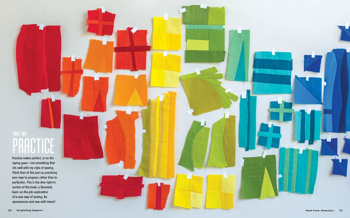
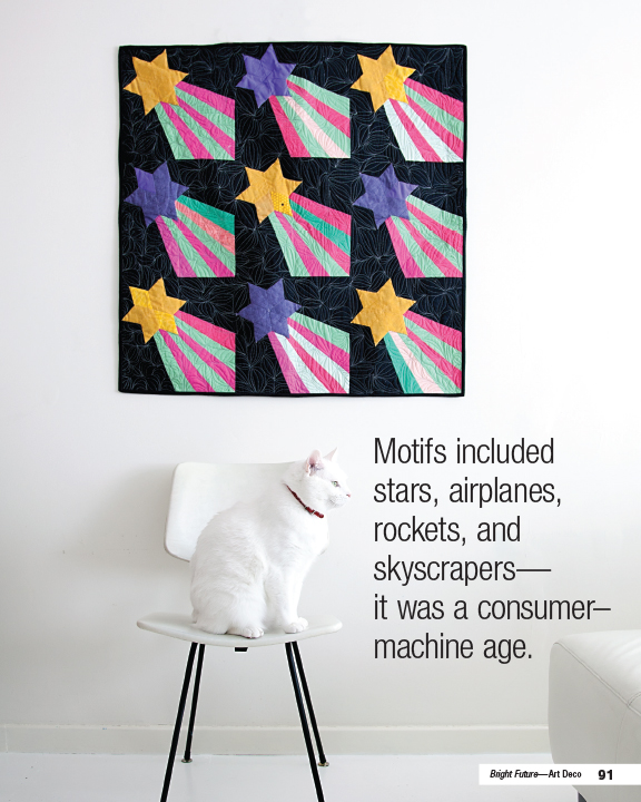
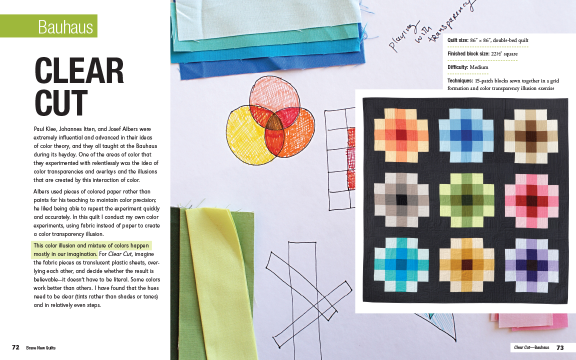
Brave New Quilts
Book Design: Kristy Zacharias (pre-P+P)
Publisher: Stash Books
Author: Kathreen Ricketson