For this Before/After, I will talk about the role photography plays in these particular layouts. Take a look at how photography, design and layout transformed Jacquie Gering's manuscript into a beautiful, functional teaching and learning tool.
BEFORE
AFTER
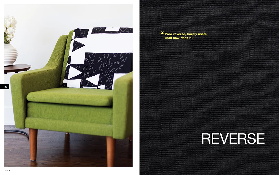
Using a large image to start off a chapter helps to break up the book and gives readers a visual cue that they are starting a new section. Plus, who doesn't love a big, pretty photo of a quilt?
When images have a soft, light background, one of my favorite things to do is to place type over the top. This integrates the image with the text and the page feels more designed and cohesive.
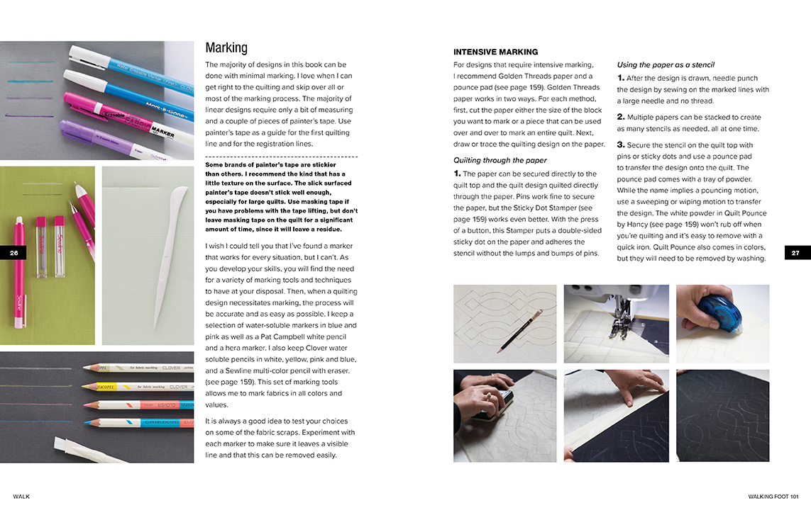
Books typically have set page counts. The publisher contracts with printers early and sets budgets with a page count in mind, so by the time the project gets to the designer, bookmaps need to be followed and content needs to fit on the page it was assigned to. Some pages have more content than others and one way that I solve the space issue for content-heavy pages is by utilizing a grid layout. I can fit more content on a page if the images are nestled together instead of being placed within the text. This solution is also great for visual-learners who like to see step-by-step processes in sequence.
While photography plays an integral role in setting the mood for a piece, think about how you can use photos as a design tool in your next layout project. It's fun and can make your piece more functional and engaging.
Happy Designing!
+ Kristy


