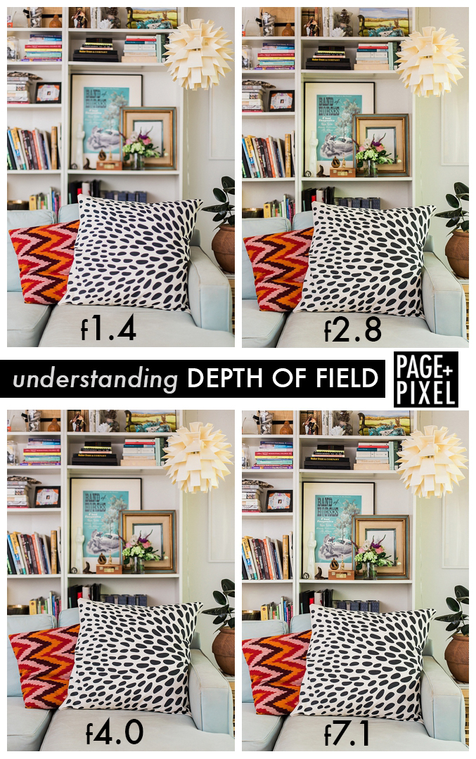
Bird’s eye, layflats, still life….whatever you call them, these are photos that require a surface to be shot on. With the camera positioned just above the subject, the styling will rely on a more graphic look due to the lack of dimension that will come from the angle of the camera. As simple as these types of photos appear, they do require a fair amount of propping and styling. It can be quite fun to create interesting lines and juxtapositions within the photo composition, but when you are short on time or on a tight budget, giving some extra thought to the surface that you’re shooting on can elevate your photos without a ton of effort.
The following images were taken for Heidi Staples’ new book, Patchwork USA (Lucky Spool Media). We played with a lot of surfaces in the styling for this book in order to achieve a warm, nostalgic aesthetic. By swapping out the different surfaces, we were able to keep the styling minimal so that the projects took center stage.

Color Book // Shot on the reverse side of a quilt in order to give a warm, sweet feeling to the image.
The window light was perfect in one of the bedrooms of the home we were shooting in. In order for the shot to make sense near that gorgeous light, we laid down a quilt with the back side up so that the top design didn’t distract from the Color Book project. The result was a textured and colorful backdrop for the cloth books. The color and the pattern immediately indicate that this is a project for children.

Scout’s Honor Pencil Case // Shot on top of a vintage map.
A strong theme that runs throughout Patchwork USA is that of road trips. Heidi sent us tons of vintage maps and postcards to use in the photography and one of my favorite ways to use the maps was as a background surface. Laying out the map adds a wonderful graphic quality to the image and it helps carry the road trip theme. Best of all, it was so easy!

Curio Pocket // Shot on top of a vintage steamer trunk.
Nissa and I have a favorite piece of perfectly weathered wood. It has the best tone and texture and it is very tempting to use it in every photo…everything looks beautiful on it! But we want to keep our images feeling new and one-of-a-kind, so we decided to play around with shooting on this vintage steamer trunk that belonged to my Grandpa. We love it!! So much life and texture is added to the photo from simply placing the projects on the edge of this trunk and by utilizing the brass details. Simple and effective!
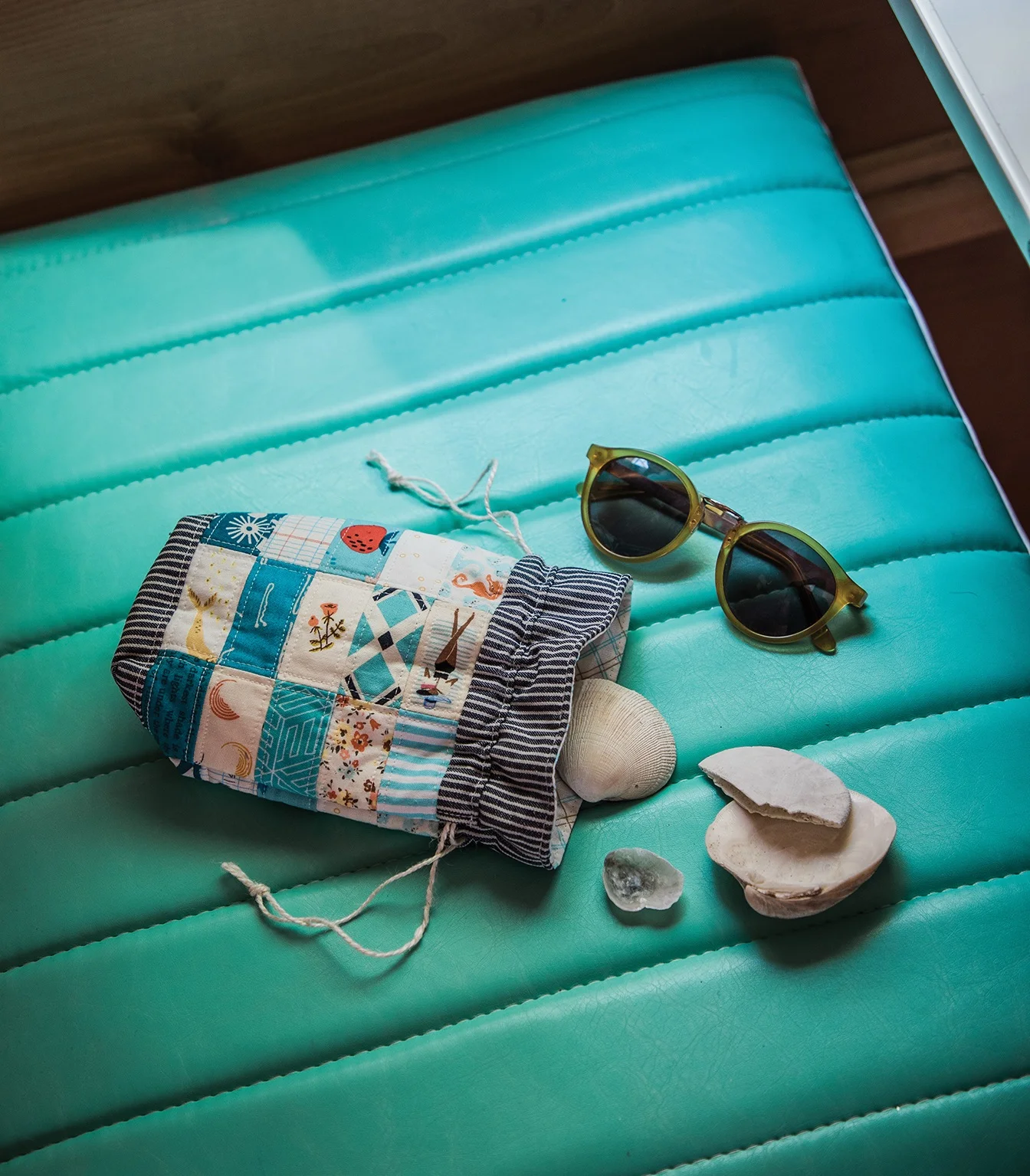
Beachcomber Drawstring Bag // Shot on a vinyl seat.
Serving multiple purposes, this vinyl seat was the perfect place to shoot this drawstring pouch. Indicating “road trip” as it is the bench seat inside a Shasta, adding an easy pop of color to the image, and creating some visual texture with the stitching on the seat, we loved using this surface as an easy way to tell a story.
While all of these projects would have looked great on our favorite weathered wood, the varied surfaces do more to tell the author’s story and really bring each of the projects to life.
What are some of your favorite surfaces to shoot on?
+
Kristy
Patchwork USA
Book Design + Photography: Page + Pixel
Publisher: Lucky Spool Media
Author: Heidi Staples