FOCUS + Recent Work // Inspiring Improv

LS_Ball_NNB_0412.jpg

I’m stuck. I’m supposed to be working on a new book design and I’m getting hung up on details that don’t usually stump me. I’ve just spent the last precious hour and a half going in circles about a design decision. I keep telling myself to “Focus”...”Stay focused”…”Make some tea and get focused”. 

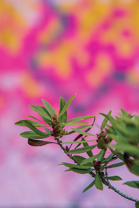
All I can think of is this photo that Nissa shot this past summer.

What a wonderfully creative, exciting, invigorating photo shoot that was. We were in Mendocino County at the beach, shooting Nicholas Ball’s book, Inspiring Improv for Lucky Spool . We rented a beach house and made a beautiful mess inside with quilts and pillows and random props all over the place and we had a plan and we stuck to it and we made a bunch of gorgeous photos. 

Imagine that—a plan! I had a plan today and it was to get this book design going, but then I got stuck—unfocused.

LS_Ball_NNB_0097.jpg

After sitting in my pitty-pot for a few minutes I started looking through the photos from the Improv shoot and reminded myself to take a break from what isn’t working. Stretching a different set of muscles for a while will do me some good. 

How about that image with the glass tray in focus? Maybe it’s just that easy to shift focus and to not dwell on what’s not working. Maybe I can remind myself that I do know what I’m doing, it’s just not what I’m focused on right now. Maybe if I let myself be confused and let myself play without a deadline and let myself be tired and rest, it will all come back clear to me. There really is no “maybe”, I’ve been here before so many times before. I know it comes back, I know this is part of the process, it’s just inconvenient.

LS_Ball_NNB_0064.jpg

When the focus comes back it feels really good. I feel settled and feel a quiet satisfaction, much like dusk in a night garden near the ocean.

+
Kristy // DESIGN


INSPIRING IMPROV is debuting at QuiltCon in February.
Book Design + Photography: Page + Pixel
Publisher: Lucky Spool Media
Author: Nicholas Ball

LS0046_InspiringImprov_FrontCover_LowRes.jpg

Book Design Award Winner // Southwest Modern

As scary as it can be, it’s good for me to put my work out there sometimes to get reviewed and critiqued by industry professionals. There’s nothing like a group of book and design-lovers giving you honest feedback!

A few months ago, I submitted Southwest Modern written by Kristi Schroeder, published by Lucky Spool, to the Publishing Professionals Network 2018 Book Show. Throughout the entire process of working on that book I felt my design juices flowing. The landscape photography that Kurt Griesbach shot and Kristi’s graphic quilts made for one of my favorite book design projects ever. I was happy the entire time that book was on my screen and I knew if I were going to submit a design that this would be it.

LSID0037_Southwest_frontcover.jpg
PubLuckySpool_SouthwestModern_Int14.jpg
PubLuckySpool_SouthwestModern_Int13.jpg

I’m thrilled to say that Southwest Modern has been awarded Honorable Mention for Book Design in the How-to + Craft Book category! I know there were a lot of beautifully designed books this year and it’s wonderful to have Page + Pixel’s design included in such great company.

Here’s to Fridays and putting ourselves out there.

+ Kristy


Styling Fabric Collections + Sewtopia Winners!

When styling photographs, Nissa and I tend to lean towards an eclectic aesthetic with layers of textures and sometimes unexpected colors. We love to create lived-in, warm looking environments and using props that match perfectly or all came from the same store make this type of look a little less believable. 

Having said that, sometimes being matchy-matchy is just what a photo needs!

sewtopia-9_WEB.jpg

Page + Pixel is a sponsor of Sewtopia, an awesome sewing retreat that happens in a different American city twice each year. It's a fun event that gives quilters a chance to veg out with their sewing projects AND explore a new city—all while being pampered with meals and snacks and prizes. One of the recurring activities is the Michael Miller Fabric Challenge. Michael Miller Fabrics provides quilters with a funky fabric collection and the participants bring a sewn item to the retreat to get voted on by the attendees. There are 3 winners (sometimes more!) and  Page + Pixel gets to take styled photos of the winners!

sewtopia-15_WEB.jpg

When shooting the projects for Sewtopia, Nissa and I decided that being inspired by the color scheme of the fabrics was the way to go. All of the projects were made using a fabric collection and it would be distracting to introduce a drastically different color. This made the styling really fun! We searched for all of the blue, orange and black props we could find...if they were space or science-themed, it was a bonus!

sewtopia-19_WEB.jpg
sewtopia-2_WEB.jpg

While styling a photo, we constantly remind our selves that the project is the star and the props play a supporting role. The key is to find the right balance so that the images still tell a story and feel authentic.

What's your propping strategy for taking photos of projects made with fabric collections?

+ Kristy

Light.

Being successful at photography, no matter what you are shooting, is all a matter of light.

Learning to harness it is a lifelong pursuit. See it, read it, bounce it, make it, love it, hate it. Become it's keeper.

35050768_10100171685583836_4398205098476437504_o.jpg

It doesn't matter what kind of camera you have, or what kind of gear you have. If you cannot harness light you cannot steadily make good photographs.

Even though I have been shooting for 10 years now, I regularly have my mind blown by something I didn't see before. It is one of my favorite things. Never ever stop watching, learning, trying.

Follow the light.

What are we all working on? Anyone want to talk about how good or bad light is being to them today?

WALK Book Design: Before/After

For this Before/After, I will talk about the role photography plays in these particular layouts. Take a look at how photography, design and layout transformed Jacquie Gering's manuscript into a beautiful, functional teaching and learning tool. 

BEFORE

WALK_before.jpg

AFTER

WALK_after3.jpg

Using a large image to start off a chapter helps to break up the book and gives readers a visual cue that they are starting a new section. Plus, who doesn't love a big, pretty photo of a quilt? 

WALK_after1.jpg

When images have a soft, light background, one of my favorite things to do is to place type over the top. This integrates the image with the text and the page feels more designed and cohesive. 

WALK_after2.jpg

Books typically have set page counts. The publisher contracts with printers early and sets budgets with a page count in mind, so by the time the project gets to the designer, bookmaps need to be followed and content needs to fit on the page it was assigned to. Some pages have more content than others and one way that I solve the space issue for content-heavy pages is by utilizing a grid layout. I can fit more content on a page if the images are nestled together instead of being placed within the text. This solution is also great for visual-learners who like to see step-by-step processes in sequence.

While photography plays an integral role in setting the mood for a piece, think about how you can use photos as a design tool in your next layout project. It's fun and can make your piece more functional and engaging.

Happy Designing!
+ Kristy